
Overview#
ArviZ-plots is the plotting library of ArviZ. It comes with “batteries-included” plots, which means it includes a set of predefined plotting functions that cover a wide range of common use cases in Bayesian data analysis, like MCMC diagnostics, predictive checks, model comparison, and more. These functions are designed to be easy to use, with sensible defaults that allow users to quickly generate high-quality plots without needing to customize every aspect of the visualization. You can take a look at the gallery to see some examples of the available plots. And you can refer to the API reference for a more detailed description of the available plotting functions.
Getting Started with ArviZ-plots#
To start, we’ll import ArviZ. We’ll also apply a default style for the plots, this is optional, but it will make the plots look nicer and include nice features like colorblind-friendly palettes.
import arviz_base as azb
import arviz_plots as azp
azp.style.use("arviz-variat")
To make the example easier to follow we are going to skip the modeling step, and assume we have already built and solve a Bayesian model. ArviZ provides several pre-saved models, so we can use one of those to demonstrate the plotting functionality. In this case we will use the centered_eight model, which is a classic, but even if you are not familiar with it, you can still follow along and see how the plotting functions work.
data = azb.load_arviz_data("centered_eight")
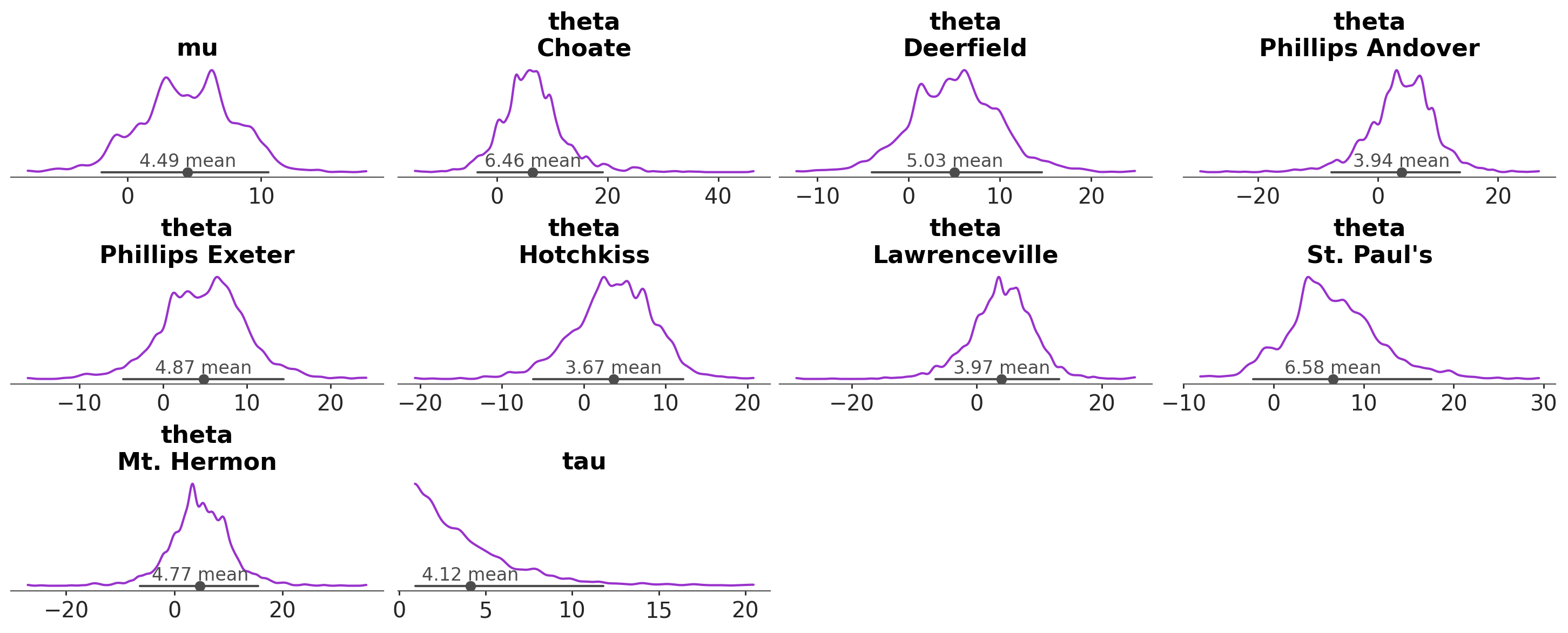
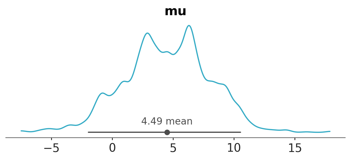
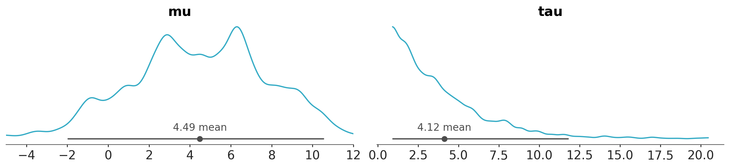
A common task in Bayesian data analysis is to compute the posterior and then inspect it visually. For instance, we can use the plot_dist function to visualize the posterior distribution of a model. By default this function produces a plot that shows the distribution of the posterior samples for each parameter in the model.
azp.plot_dist(data);
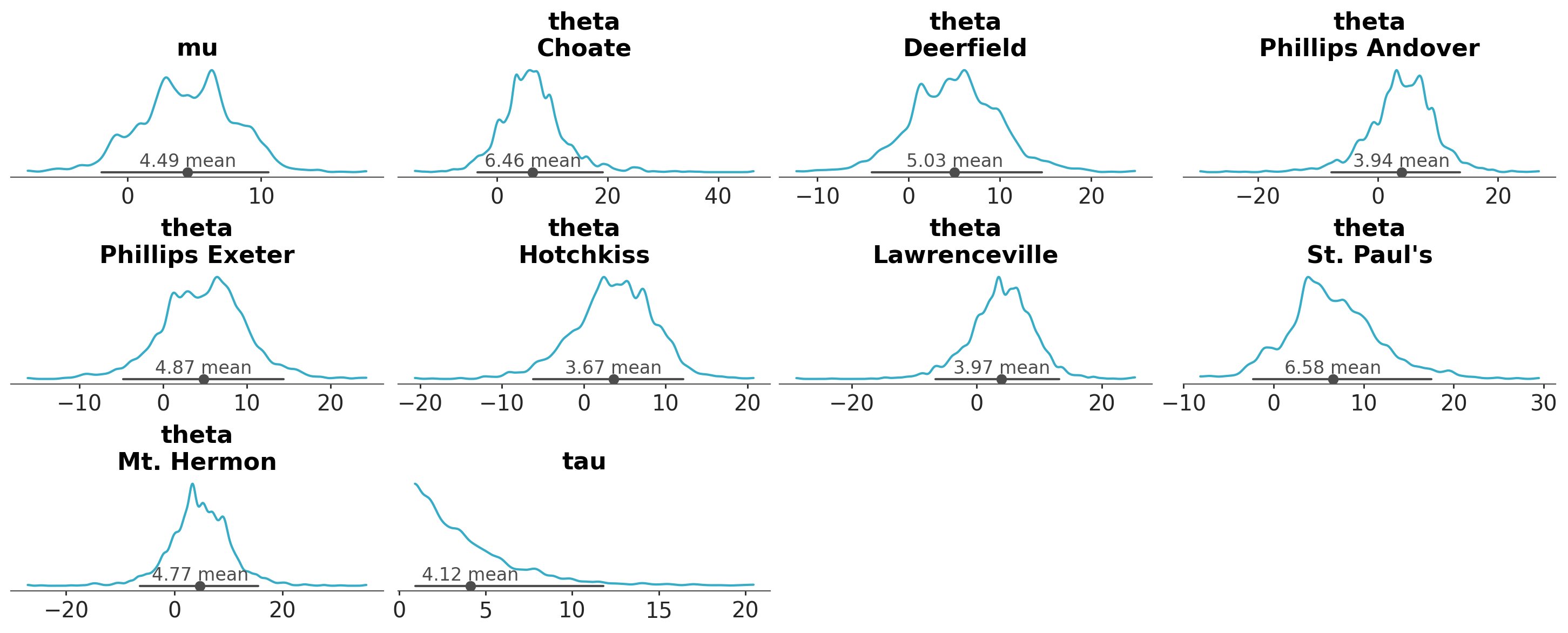
As we can see, each marginal of the posterior distribution is represented using a kernel density estimate (KDE). In this example, there are 3 variables (or parameters), mu, tau and theta, the first two are unidimesional, while theta is a vector of length 8. Thus, in total we got 10 plots. In addition to the KDE, the plot includes a point interval that shows the mean and the 94% equal-tailed credible interval.
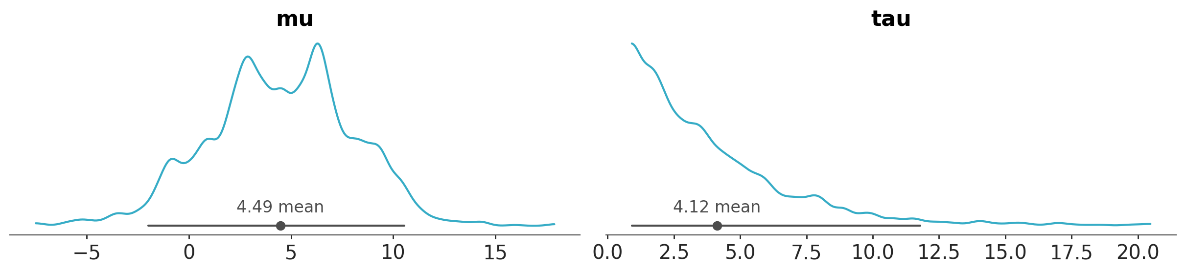
If we want to focus on a specific variable or a subset of variables, we can use the var_names argument to specify which ones to display. We simply pass the names of the variables we’d like to plot.
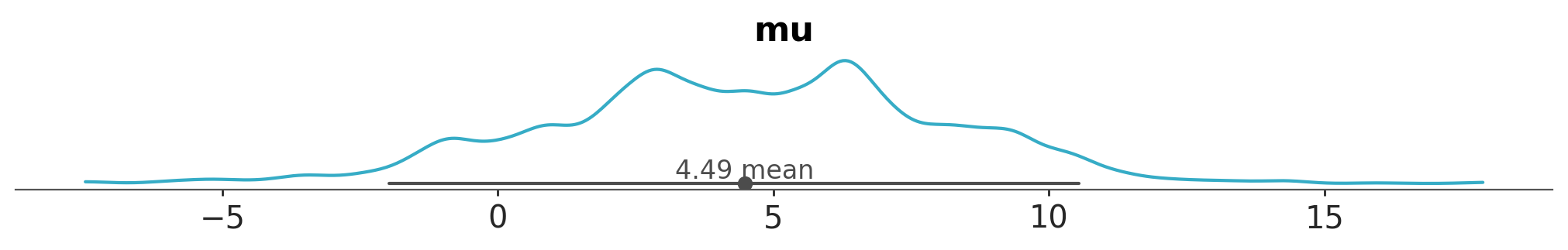
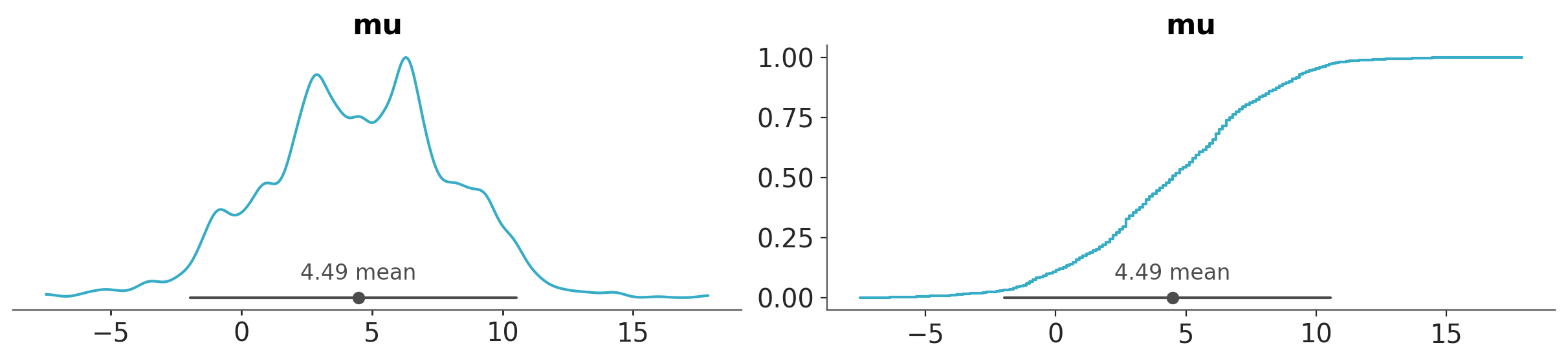
azp.plot_dist(data, var_names=["mu", "tau"]);
or negate the ones we don’t want to plot.
azp.plot_dist(data, var_names=["~theta"]);
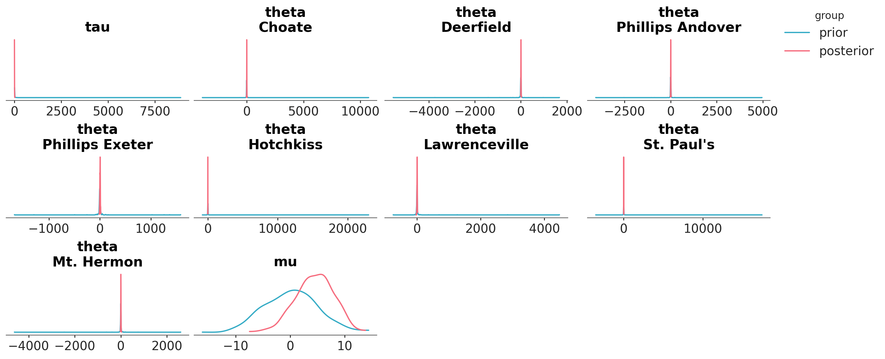
Let’s say that we want to visualize the posterior distribution and the prior distribution together. We can use the plot_prior_posterior function. Because the prior is much wider than the posterior (except for mu), we see that the prior looks almost flat and the posterior is a spike.
azp.plot_prior_posterior(data);
ArviZ and DataTree#
So far we have seen two functions, they both use the same input data, but generate different results. This is a common pattern in ArviZ, we pass an object like data and ArviZ generates a plot based on the function we call. This allows us to easily switch between different types of plots without having to change the underlying data structure. Internally ArviZ selects the necessary subset of the data to generate the plot. Thus, we don’t need to worry about the details of how the data is organized or how to extract the relevant information for each plot, unless we want to.
In this example, data is a DataTree object; a flexible and efficient structure for storing and manipulating data in ArviZ. While DataTrees are used extensively in ArviZ, they are not specific to it; they are actually a core data structure in the xarray library. We rely on DataTrees because they offer a powerful way to represent multi-dimensional data with labeled axes, making it straightforward to work with complex datasets, including those generated during a Bayesian workflow, such as posterior samples, prior samples, and sampling statistics. This structure promotes clear organization and simplifies both data access and manipulation.
To keep this introduction short and simple we are going to focus our attention on some very general concepts related to DataTrees in the context of plotting with ArviZ. Details on how to work with DataTrees, and a description of other data-structures used by ArviZ, can be found in the Working With DataTree guide.
At a high level, a DataTree is a hierarchical structure with groups, the number of groups vary but within ArviZ we have a convention for the names of the groups. For instance, the posterior samples are stored in a group called posterior, the prior samples are stored in a group called prior, and the sampling statistics (stuff related to the inner workings of samplers) are stored in a group called sample_stats. This allows for a clear organization of the data, making it easy to access and manipulate.
Let’s see the groups in centered_eight:
data.groups
('/',
 '/posterior',
 '/posterior_predictive',
 '/log_likelihood',
 '/sample_stats',
 '/prior',
 '/prior_predictive',
 '/observed_data',
 '/constant_data')
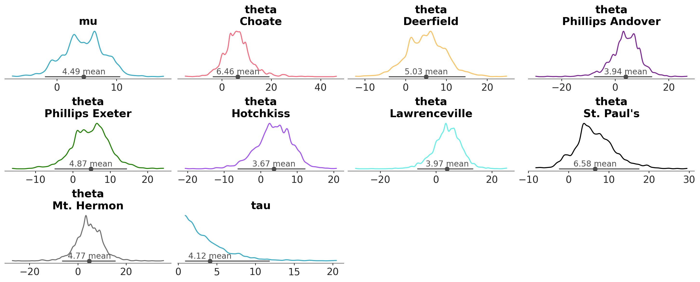
Each group can contain multiple variables. We already saw that we have mu, theta, and tau. And each variable can have multiple dimensions. For instance, the variable mu has a dimension called chain, which represents the different chains used in the MCMC sampling process, and a dimension called draw, which represents the different samples drawn from the posterior distribution. theta has these two dimensions plus a dimension called school, which represents the 8 schools in the model.
data.posterior.data_vars
Data variables:
    mu       (chain, draw) float64 16kB 7.872 3.385 9.1 ... 1.767 3.486 3.404
    theta    (chain, draw, school) float64 128kB 12.32 9.905 ... 6.762 1.295
    tau      (chain, draw) float64 16kB 4.726 3.909 4.844 ... 2.741 2.932 4.461
This is a more complete view of the content of the posterior group
data.posterior
<xarray.DatasetView> Size: 165kB
Dimensions:  (chain: 4, draw: 500, school: 8)
Coordinates:
  * chain    (chain) int64 32B 0 1 2 3
  * draw     (draw) int64 4kB 0 1 2 3 4 5 6 7 ... 493 494 495 496 497 498 499
  * school   (school) <U16 512B 'Choate' 'Deerfield' ... 'Mt. Hermon'
Data variables:
    mu       (chain, draw) float64 16kB 7.872 3.385 9.1 ... 1.767 3.486 3.404
    theta    (chain, draw, school) float64 128kB 12.32 9.905 ... 6.762 1.295
    tau      (chain, draw) float64 16kB 4.726 3.909 4.844 ... 2.741 2.932 4.461
Attributes:
    created_at:                 2022-10-13T14:37:37.315398
    arviz_version:              0.13.0.dev0
    inference_library:          pymc
    inference_library_version:  4.2.2
    sampling_time:              7.480114936828613
tuning_steps: 1000Exploring groups, dimensions and coordinates#
By default, each “batteries-included” plot will use one or more of the available groups. For instance the plot_dist function will use the posterior group, while the plot_prior_posterior function will use both the prior and posterior groups. These two plots combine the chain and draw dimensions to produce the final plot. That’s why we get a single plot for each variable (each one consisting of 2000 samples, 4 chains x 500 draws). But notice that the dimension school is not “reduced”, instead it is used to facet the data, i.e. we get a separate plot for each school.
All these defaults can be changed, as we already saw with the variable_names argument. Usually ArviZ plotting function will have a group argument. How flexible this argument is depends on the function, one on extreme plot_prior_posterior ignores this argument and always uses the prior and posterior groups, while on the other extreme plot_dist is very flexible and allows us to specify many groups we may want to plot.
Let’s set group to posterior_predictive. Can you anticipate what we will get?
azp.plot_dist(data, group="posterior_predictive");
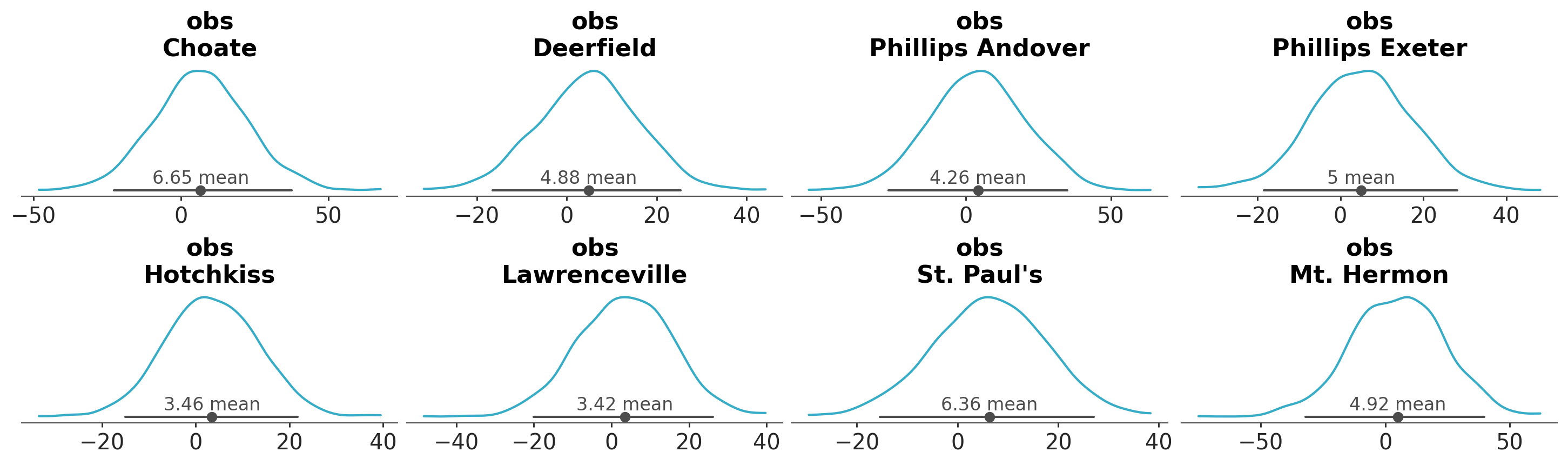
We get predictions of the model at each observation. In this example, we have 8 observations, so we get 8 plots.
ArviZ does not come with guarantees that any possible combination of arguments that you may want to try will work, or that the generated result will be sensible or useful. Defaults usually are, but then you are free to explore the data as you wish and be responsible for the results.
For instance
az.plot_dist(data, group="sample_stats")
will not work, because the sample_stats group does not contain any samples to plot. However,
azp.plot_dist(data, group="log_likelihood");
will work, and it will plot the log-likelihood of the model for each observation. How useful is this, it depends on the context the analysis.
Results may vary for different models, for instance.
dt = azp.load_arviz_data("radon")
azp.plot_dist(dt, group="posterior_predictive");
will run, but it may crash your session, because for the radon model the posterior_predictive group contains 919 observations. So the above code will try to plot 919 KDEs!, which may be too much for your system to handle.
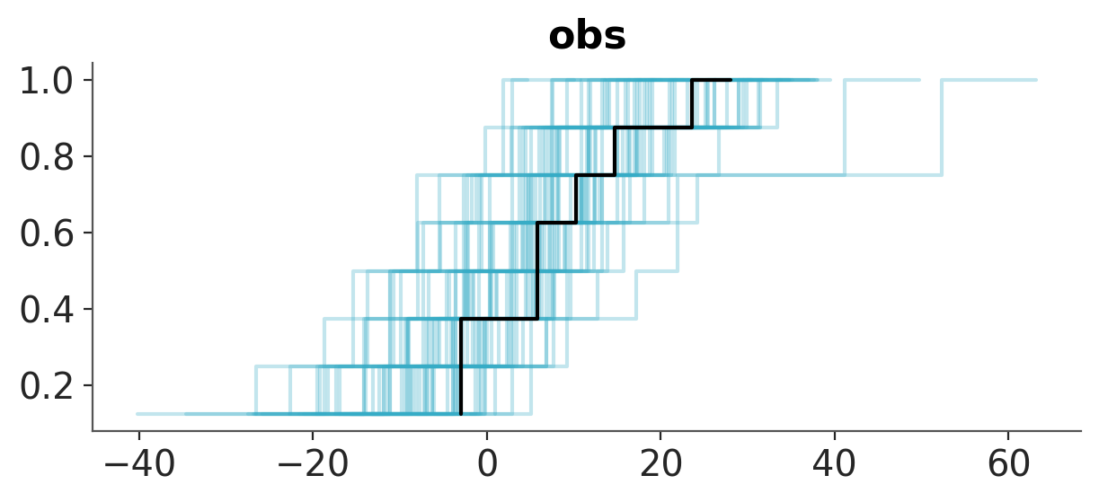
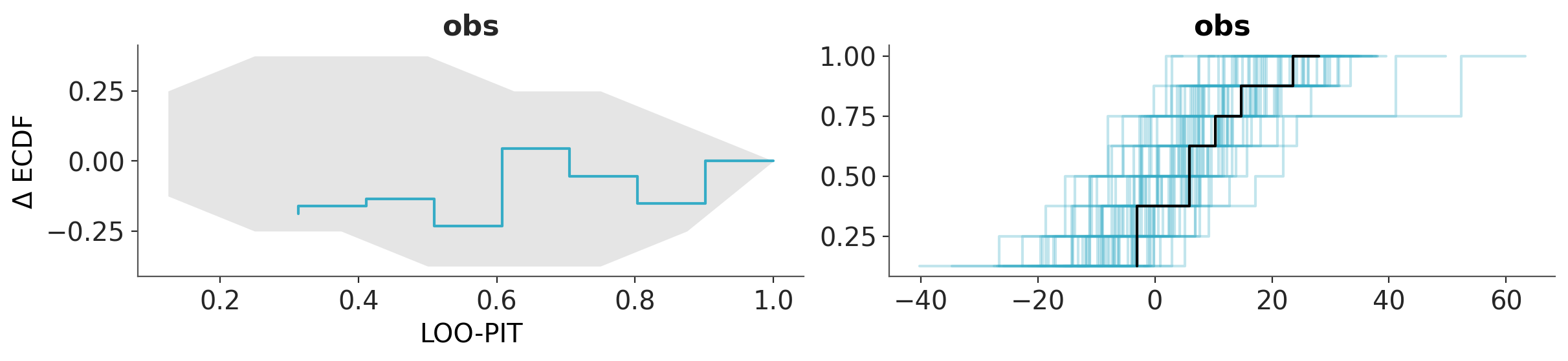
Because checking the posterior predictive distribution is a common task in Bayesian data analysis, ArviZ provides several specialized functions for this purpose. One of them is plot_ppc_dist. This function is designed to handle posterior predictive checks and will produce a more sensible plot than plot_dist when used with the posterior_predictive group. In the followings example we use the empirical cumulative distribution function ECDF to visualize the posterior predictive distribution of the model.
# try using dt = azp.load_arviz_data("radon")
azp.plot_ppc_dist(data, kind="ecdf");
We want to note that you can use .plot_dist(dt, group="posterior_predictive") to do posterior predictive checks, actually plot_ppc_dist is using it. However, it will require more effort on your part, as you will need to adjust several other arguments and take additional steps to obtain a meaningful result.
Sample_dims#
Now, we are going to discuss the sample_dims argument. This argument is used to specify which dimensions of the data should be reduced when plotting. An example will help us understand this better. Let’s say we want to use the plot_dist function to visualize the distribution of the data. If we do:
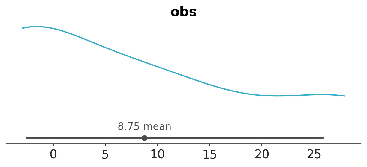
azp.plot_dist(data, group="observed_data");
We will get an error, ArviZ will attempt to generate one plot per observation, and we can not compute a KDE (or ECDF or histogram) with a single point. By default, sample_dims is set to ["chain", "draw"], but those dimensions are not present (or meaningful) in the observed_data group. What we want to do is to plot the marginal distribution of the observed data, i.e. we don’t care about which school the data comes from, we just want to see the distribution of the observed data across all schools. So, we can change sample_dims to ["school"].
azp.plot_dist(data, group="observed_data", sample_dims=["school"]);
If we were interested in the posterior distribution for mu per chain, we could do:
azp.plot_dist(data,
              var_names=["mu"],
              sample_dims=["draw"]);
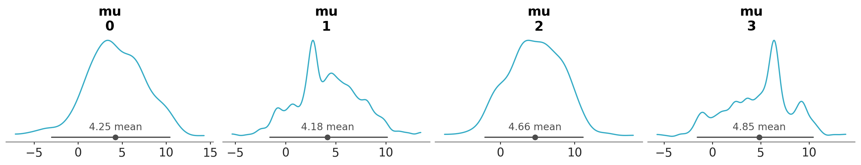
A KDE that appears overly spiky or irregular may indicate issues with specific chains, such as poor convergence or pathological sampling behaviour. However, diagnosing these issues is beyond the scope of this tutorial, to learn more about MCMC diagnostics, please refer to the MCMC Diagnostics chapter from the EABM guide.
Coords#
We can use the coords argument to specify which coordinates we want to use for the plot. This is useful to filter variables across dimensions. For instance, if we want to plot the posterior distribution of only a subset of schools, we can do:
azp.plot_dist(data,
              var_names=["mu", "theta"],
              coords={"school": ["Choate", "Deerfield"]},
              );
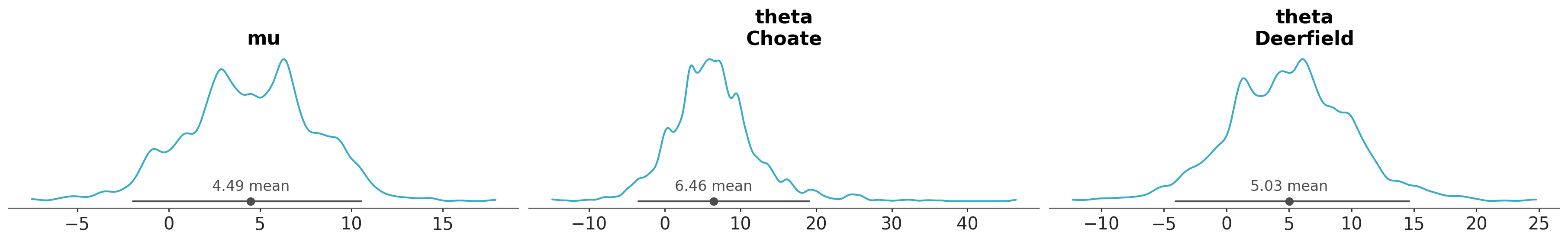
Notice that the coords argument is used to select specific schools and thus it does not affect variables without the school dimension, like mu.
Global defaults#
ArviZ provides a set of global defaults that, once modified, influence the behaviour of multiple functions across the library. ArviZ’s plots, like plot_dist takes from here the default value for sample_dims and other arguments. They are stored in azb.rcParams, for further details you can read Configuration. Can you spot, the default values for interval and their probability?
azb.rcParams
RcParams({'data.http_protocol': 'https',
          'data.index_origin': 0,
          'data.sample_dims': ('chain', 'draw'),
          'data.save_warmup': False,
          'plot.backend': 'matplotlib',
          'plot.density_kind': 'kde',
          'plot.max_subplots': 40,
          'stats.ci_kind': 'eti',
          'stats.ci_prob': 0.94,
          'stats.ic_compare_method': 'stacking',
          'stats.ic_pointwise': True,
          'stats.ic_scale': 'log',
          'stats.module': 'base',
          'stats.point_estimate': 'mean'})
If we don’t like the default value of 0.94 for the credible interval, we can change it globally:
azb.rcParams["stats.ci_prob"] = 0.95
This will change the default value for the credible interval to 0.95 for all subsequent calls to plot_dist and other functions that use this parameter, or we can change it per call:
azp.plot_dist(data, group="posterior", ci_prob=0.95)
More about arguments#
Some arguments are shared across all (or almost all) plotting functions, like var_names, group, and sample_dims. These arguments allow us to customize the plots by selecting which variables to display, which group of data to use, and how to reduce the dimensions of the data. Other arguments are specific to each plotting function (or related functions). For instance, we have seen that plot_dist has a kind argument that allows us to choose the type of plot we want to generate, such as a KDE, histogram, or ECDF. Or ci_prob that allows us to set the probability for the credible interval.
We are now going to discuss some arguments that are central to the ArviZ plotting functions and that will help us understand how to customize the plots further.
visuals#
If you inspect the documentation for plot_dist you may notice that there are no arguments with names like color, linestyle or figsize. Nor arguments like bins or bandwidth that are common in other plotting libraries. That does not mean that you can not change them, it just means that you will need to use “dictionary arguments”. The rationale behind this is that ArviZ aims to provide a flexible and consistent interface for plotting, by using dictionary arguments we allow for flexibility in customizing the plots without cluttering the function signature with too many arguments.
For example to change the colors of the KDEs we can do:
azp.plot_dist(data, visuals={"kde": {"color": "darkorchid"}});
Hopefully, the example above provides a hint of how to use the visuals argument. But, let’s go through it in more detail.
In ArviZ, we use the visual to reference to the graphical elements we see in a plot, like a title, a KDE, a credible_interval, etc.
The valid keys for the dictionary passed to the visuals argument, are graphical elements and the values are passed to internal functions that are in charge to represent each of those graphical elements.
To find the valid keys for visuals, you can check the docstring of each function. For plot_dist we have:
One of “kde”, “ecdf”, or “hist”, matching the
kindargument.credible_interval
point_estimate
point_estimate_text
title
rug
remove_axis
Notice how all these keys are related to the graphical elements of previous plot. Except for rug that is not shown by default and remove_axis that allows us to remove the y-axis from the plot.
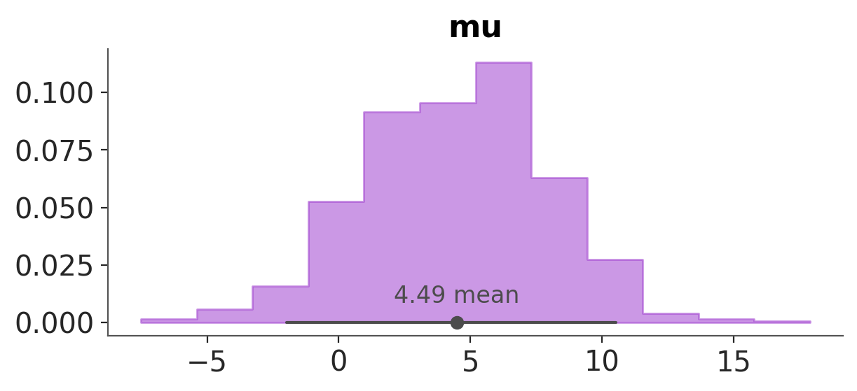
Let’s play a bit with the visuals argument, so we get more familiar with it. Let’s plot a histogram and change the transparency and color of the bars:
azp.plot_dist(data,
              var_names=["mu"],
              kind="hist",
              visuals={"hist": {"alpha": 0.5, "color": "darkorchid"}},
              );
To plot a step-like histogram, without the y-axis and without the text for the point_estimate_text.
azp.plot_dist(data,
              var_names=["mu"],
              kind="hist",
              visuals={"hist": {"step": True},
                       "remove_axis":True, # this can only be True or False
                       "point_estimate_text":False, # this can only be False or some value valid for text like "fontsize" or "color"
                        },
              );
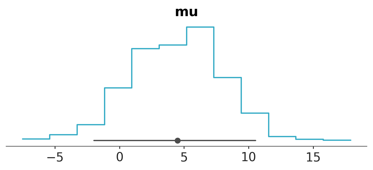
A note on "remove_axis": Internally, there’s a function that can remove the x-axis, y-axis, or both. In the case of plot_dist, it’s hardcoded to remove the y-axis. The reasoning is that the x-axis always carries meaningful information for plot_dist, whereas the y-axis may not.
stats#
If instead of changing visual properties, like colors, we want to change statistical properties, like the number of bins used for a histogram we must use the argument stats.
azp.plot_dist(data,
              var_names=["mu"],
              kind="hist",
              stats={"density": {"bins": "auto"}},
              );
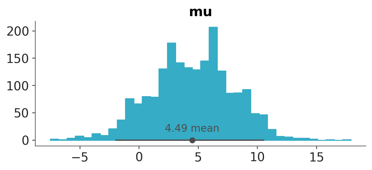
Notice that this time the key density does not need to match the kind argument. Also notice than in general, if you pass values that are not valid for a specific computation, they will be ignored. For instance, if you pass {bins:10} to a KDE plot, it will be ignored, because KDEs do not use bins.
azp.plot_dist(data,
              var_names=["mu"],
              kind="kde",
              stats={"density": {"bins": 10}},  # this does not affect the KDE
              );
To see the valid keys check the docstring for each function, for azp.plot_dist they are:
density. Controls how the KDE, Histogram or ECDF are computed.
credible_interval. Control how the equal-tailed interval (ETI) or highest density interval (HDI) are computed.
point_estimate. Control how the mean or median are computed.
pc_kwargs and aes_by_visuals#
Another argument is pc_kwargs, we can use is to change the number of columns.
azp.plot_dist(
    data,
    col_wrap=10,
);

Or change the figure size
azp.plot_dist(
    data,
    var_names=["mu"],
    figure_kwargs={"figsize": (10, 1.5)},
);
Or we can map a color to a variable in the data.
azp.plot_dist(
    data,
    aes={"color": ["school"]},
);
The name aes comes from the term aesthetics. We use aesthetic for a graphical property that is being used to encode data. In this case we use color to encode the school dimension. Because the variables mu and tau don’t have that dimension they are assigned the same color. We say this color is “neutral” because is not encoding any specific information.
In the previous example we told ArviZ to map the color argument to the school dimension. But that did not affect other visuals than the “kde”. That makes as wonder at least two questions, why? And how to change the color of other visuals, like the credible and point estimates?
The answer to the first question is that the color argument by default is only mapped to the KDE (or the ECDF or the histogram, depending on the kind argument). The answer to the second question is that we can change that by using the aes_by_visuals argument.
azp.plot_dist(
    data,
    aes={"color": ["school"]},
    aes_by_visuals={
        #"kde": ["color"], # this is the default, so it can be omitted
        "point_estimate": ["color"],
        "credible_interval": ["color"],
    },
);
PlotCollection: Peeking Under the Hood#
Compared to visuals and stats the name pc_kwargs may not be that obvious, at least at first. So let’s fix that. The “pc” stands for PlotCollection. ArviZ plots are generated by first populating a PlotCollection object with the graphical elements that will be used to generate the final figure. PlotCollection provides the logic to loop over each plot, assign the correct data, aesthetics, and other properties to each plot, and then render them in a single figure. You can learn about it in the intro to PlotCollection tutorial.
When using batteries-included plots you don’t need to directly interact with PlotCollection, you will only need it, if you want to create your custom plot, or to perform some tweaks that can not be achieved via the provided arguments. For instance, to manually set the limit of the x-axis for the variable mu we can do:
pc = azp.plot_dist(
    data,
    var_names=["mu", "tau"],
)

pc.get_viz("plot", "mu").set_xlim(-5, 12);
This works because a PlotCollection object stores information like the matplotlib axes, that we can access and modify directly.
pc.get_viz("plot", "mu")
<Axes: title={'center': 'mu'}>
Plotting backends#
So far we have being using the matplotlib backend, but tree other backends are available, plotly, bokeh, and none. The first two produce actual plots, while the last one does not produce any plot. Again, for most common use you should not need to worry about the none backend. Which backend to use depends on your needs and preferences. To use the backend you need to have it installed, you can have one, two, or all of them installed at the same time. You can globally set the backend by changing the value of:
azb.rcParams["plot.backend"]
or using the backend argument in the plotting function.
One important thing to understand is that the “structure” of PlotCollection is the same for all backends, but the actual information stored will change. For example
pc = azp.plot_dist(
    data,
    var_names=["mu", "tau"],
    backend="plotly"
);
print(pc.get_viz("plot", "mu"))
<arviz_plots.backend.plotly.PlotlyPlot object at 0x7571be4a1130>
See, we can still access pc.get_viz("plot", "mu"), but its content is not the same as before.
Combining plots#
Sometimes we want to combine different plots into a single figure. For example, we may want to plot the posterior distribution of the variable mu with a KDE and a ECDF in the same figure. We can do that using the combine_plots function. This function takes a DataTree (or other valid input) and a list of plotting functions.
pc = azp.combine_plots(
    data,
    [
        (azp.plot_dist, {"kind": "kde"}),
        (azp.plot_dist, {"kind": "ecdf"}),
    ],
    var_names=["mu"],
)
The list of plots can be of different types, but some restrictions apply, like they should operate on the same group and variable names.
pc = azp.combine_plots(
    data,
    [
        (azp.plot_loo_pit, {}),
        (azp.plot_ppc_dist, {"kind": "ecdf"}),
    ],
    group="posterior_predictive",
)
See also
arviz-base data related functionality, including converters from different PPLs.
arviz-stats for statistical summaries, diagnostics, metrics and other estimators.
Exploratory Analysis of Bayesian Models online book.
The intro to PlotCollection tutorial, for more advanced usage of ArviZ plotting functions.
The your custom plot tutorial, to learn how to create your own custom plots using ArviZ.