This tutorial covers handling PlotCollection; its main attributes and methods, and how to use it to modify the figure it contains. It does not cover how to create a PlotCollection. Consequently, this should not be the first time you are hearing about PlotCollection. If you are not, we recommend first going over either one of the following two pages:
Introduction to batteries-included plots which introduces the “batteries-included” plots. That is, functions that take data and generate a specific type of plot, using opinionated defaults. All these functions return a PlotCollection object.
viz: organized storage of plotting backend objects#
The .viz attribute contains most of the elements that comprise the visualization itself: the figure, plots and visuals.
“most of” because while the figure and plot elements are created directly by methods of PlotCollection like grid or
wrap, visuals are created by external functions executed through PlotCollection as many times as needed on the indicated plots,
and some of these functions might not return an object from the plotting backend library to store.
ArviZ plotting functions aim to store as many visuals as possible. This makes all visual elements available to further customization after the function has been called.
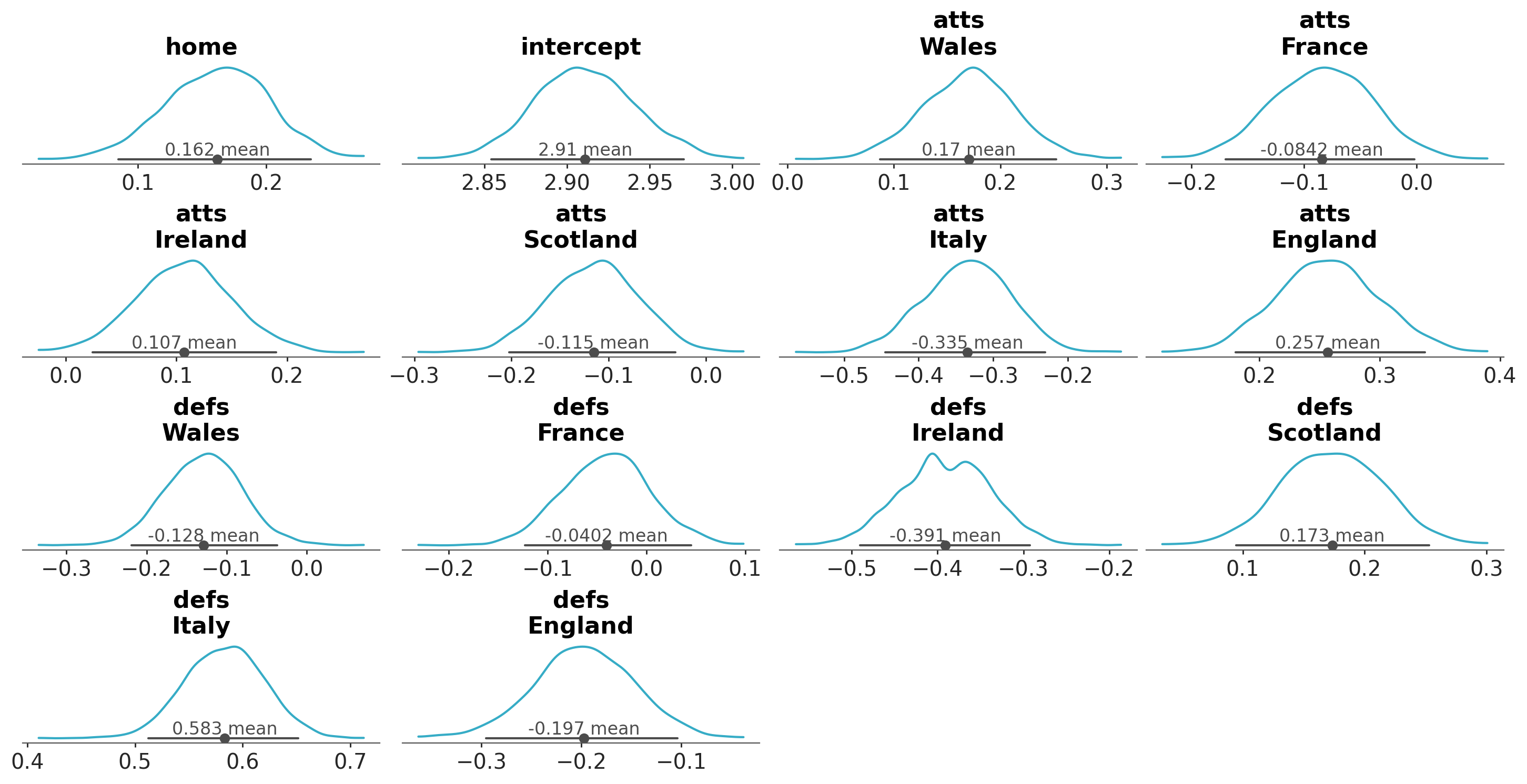
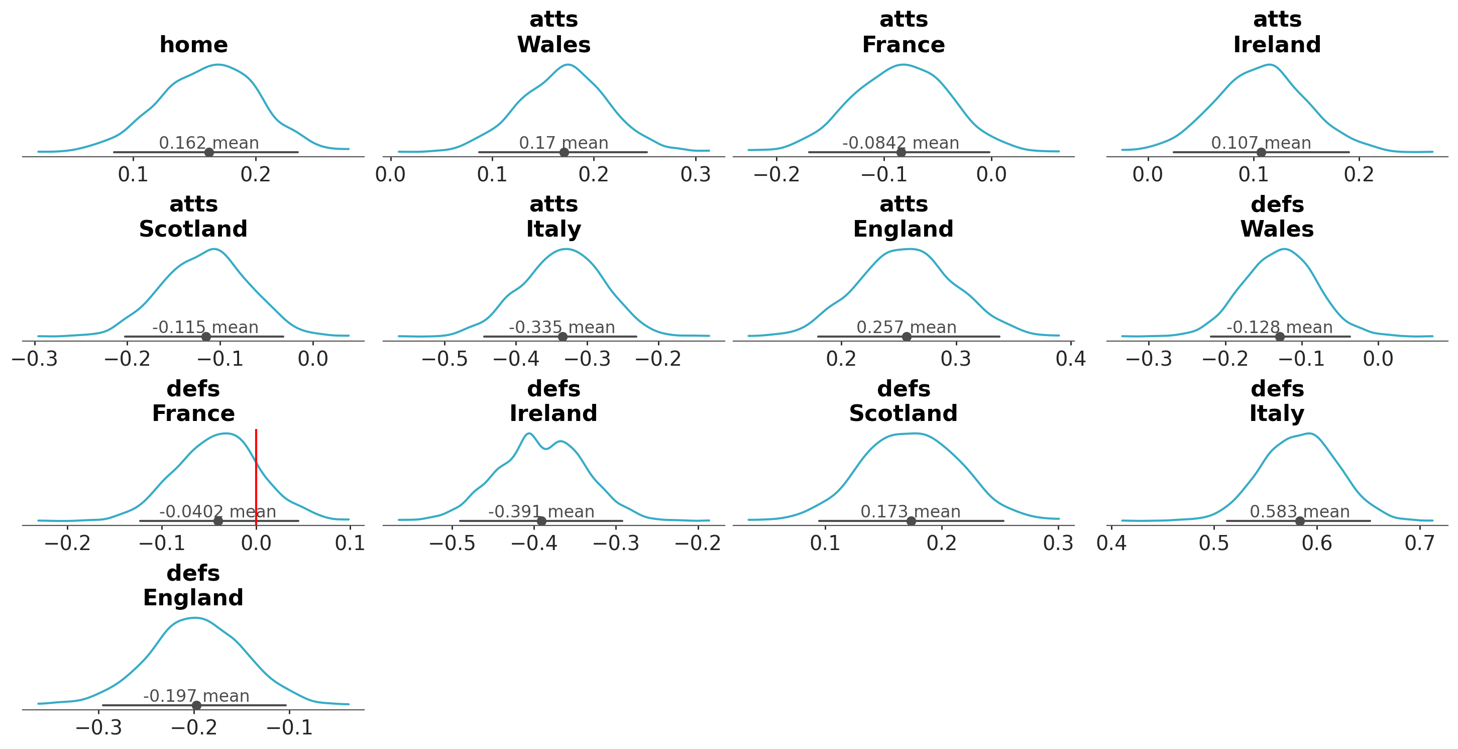
Let’s see what are the contents of the PlotCollection returned by plot_dist:
array(<matplotlib.lines.Line2D object at 0x77892201d5b0>, dtype=object)
intercept
()
object
Line2D(_child0)
array(<matplotlib.lines.Line2D object at 0x778921c65ac0>, dtype=object)
atts
(team)
object
Line2D(_child0) ... Line2D(_child0)
array([<matplotlib.lines.Line2D object at 0x778921c66720>,
       <matplotlib.lines.Line2D object at 0x778921c67410>,
       <matplotlib.lines.Line2D object at 0x778921c900b0>,
       <matplotlib.lines.Line2D object at 0x778921c90d40>,
       <matplotlib.lines.Line2D object at 0x778921c919a0>,
       <matplotlib.lines.Line2D object at 0x778921c92660>], dtype=object)
defs
(team)
object
Line2D(_child0) ... Line2D(_child0)
array([<matplotlib.lines.Line2D object at 0x778921c93290>,
       <matplotlib.lines.Line2D object at 0x778921c93f50>,
       <matplotlib.lines.Line2D object at 0x778921ca0c20>,
       <matplotlib.lines.Line2D object at 0x778921ca1850>,
       <matplotlib.lines.Line2D object at 0x778921ca2480>,
       <matplotlib.lines.Line2D object at 0x778921ca30e0>], dtype=object)
array(<matplotlib.lines.Line2D object at 0x778921ca3bf0>, dtype=object)
intercept
()
object
Line2D(_child1)
array(<matplotlib.lines.Line2D object at 0x778921cb4380>, dtype=object)
atts
(team)
object
Line2D(_child1) ... Line2D(_child1)
array([<matplotlib.lines.Line2D object at 0x778921cb4c20>,
       <matplotlib.lines.Line2D object at 0x778921cb5640>,
       <matplotlib.lines.Line2D object at 0x778921cb6000>,
       <matplotlib.lines.Line2D object at 0x778921cb6a20>,
       <matplotlib.lines.Line2D object at 0x778921cb7410>,
       <matplotlib.lines.Line2D object at 0x778921cb7e30>], dtype=object)
defs
(team)
object
Line2D(_child1) ... Line2D(_child1)
array([<matplotlib.lines.Line2D object at 0x778921cc08c0>,
       <matplotlib.lines.Line2D object at 0x778921cc12e0>,
       <matplotlib.lines.Line2D object at 0x778921cc1d00>,
       <matplotlib.lines.Line2D object at 0x778921cc2720>,
       <matplotlib.lines.Line2D object at 0x778921cc3110>,
       <matplotlib.lines.Line2D object at 0x778921cc3b30>], dtype=object)
<xarray.DatasetView> Size: 304B
Dimensions:    (team: 6)
Coordinates:
  * team       (team) <U8 192B 'Wales' 'France' 'Ireland' ... 'Italy' 'England'
Data variables:
    home       object 8B <matplotlib.collections.PathCollection object at 0x7...
    intercept  object 8B <matplotlib.collections.PathCollection object at 0x7...
    atts       (team) object 48B <matplotlib.collections.PathCollection objec...
    defs       (team) object 48B <matplotlib.collections.PathCollection objec...
array(<matplotlib.collections.PathCollection object at 0x778921c3a570>,
      dtype=object)
intercept
()
object
<matplotlib.collections.PathColl...
array(<matplotlib.collections.PathCollection object at 0x778921cd0230>,
      dtype=object)
atts
(team)
object
<matplotlib.collections.PathColl...
array([<matplotlib.collections.PathCollection object at 0x778921cd2120>,
       <matplotlib.collections.PathCollection object at 0x778921cd2900>,
       <matplotlib.collections.PathCollection object at 0x778921cd3c50>,
       <matplotlib.collections.PathCollection object at 0x778921d356d0>,
       <matplotlib.collections.PathCollection object at 0x778921cd0d40>,
       <matplotlib.collections.PathCollection object at 0x778921cefb60>],
      dtype=object)
defs
(team)
object
<matplotlib.collections.PathColl...
array([<matplotlib.collections.PathCollection object at 0x778921cf8bc0>,
       <matplotlib.collections.PathCollection object at 0x778921cd1160>,
       <matplotlib.collections.PathCollection object at 0x778921e92150>,
       <matplotlib.collections.PathCollection object at 0x778921ca3920>,
       <matplotlib.collections.PathCollection object at 0x778921cec920>,
       <matplotlib.collections.PathCollection object at 0x778921d0d640>],
      dtype=object)
array(<Figure size 2880x1468.27 with 16 Axes>, dtype=object)
As you can see by inspecting the HTML interactive view right above, the .viz attribute is a DataTree with 8 groups. There will always be one group per visual. In contrast, Plots can be either groups or data, depending on the faceting strategy. In this case, we are faceting over the variables, so plot is a group. Thus, the eight groups are:
plot: the backend objects that correspond to the plot elements.
row_index and col_index: integer indicators of the row and column each plot occupies within the figure
kde, credible_interval, point_estimate, point_estimate_text and title: the visuals corresponding respectively to: the KDE line (blue line), credible interval line (gray horizontal line), the point estimate dot (gray circle), the point estimate annotation (gray text over the point estimate) and the title (in bolded black font over each plot).
Each group will have variables matching the variables in the input data (or a subset of them). The dimensions of each group are independent. So are the dimensions of each variable. These may be different for each visual group, and may even be different among the variables within each group.
Moreover, there is a global figure variable which is always a scalar.
Important
The structure of the .viz attribute is backend agnostic, but its contents are backend dependent.
In the first case, we generated the plot with matplotlib so the objects stored are matplotlib objects like Figure, Axes, Line2D or Text.
In the last cell, we have instead generated the plot with bokeh. Thus, the objects stored are bokeh objects like Column, Figure, GlyphRenderer or Title.
Given the .viz attribute stores the visual elements that go into making one plot, let’s try inspecting the result of a different function:
array([<matplotlib.lines.Line2D object at 0x77891c84f4a0>,
       <matplotlib.lines.Line2D object at 0x77891c84f560>,
       <matplotlib.lines.Line2D object at 0x77891c84fef0>,
       <matplotlib.lines.Line2D object at 0x77891c878290>], dtype=object)
atts
(chain, team)
object
Line2D(_child4) ... Line2D(_chil...
array([[<matplotlib.lines.Line2D object at 0x77891c8785f0>,
        <matplotlib.lines.Line2D object at 0x77891c8788f0>,
        <matplotlib.lines.Line2D object at 0x77891c878bc0>,
        <matplotlib.lines.Line2D object at 0x77891c878ef0>,
        <matplotlib.lines.Line2D object at 0x77891c879250>,
        <matplotlib.lines.Line2D object at 0x77891c879520>],
       [<matplotlib.lines.Line2D object at 0x77891c879820>,
        <matplotlib.lines.Line2D object at 0x77891c879af0>,
        <matplotlib.lines.Line2D object at 0x77891c879df0>,
        <matplotlib.lines.Line2D object at 0x77891c87a0c0>,
        <matplotlib.lines.Line2D object at 0x77891c87a3f0>,
        <matplotlib.lines.Line2D object at 0x77891c87a690>],
       [<matplotlib.lines.Line2D object at 0x77891c87a960>,
        <matplotlib.lines.Line2D object at 0x77891c87ac90>,
        <matplotlib.lines.Line2D object at 0x77891c87af30>,
        <matplotlib.lines.Line2D object at 0x77891c87b230>,
        <matplotlib.lines.Line2D object at 0x77891c87b4d0>,
        <matplotlib.lines.Line2D object at 0x77891c87b7d0>],
       [<matplotlib.lines.Line2D object at 0x77891c87bad0>,
        <matplotlib.lines.Line2D object at 0x77891c87bdd0>,
        <matplotlib.lines.Line2D object at 0x77891c6ac0e0>,
        <matplotlib.lines.Line2D object at 0x77891c6ac380>,
        <matplotlib.lines.Line2D object at 0x77891c6ac650>,
        <matplotlib.lines.Line2D object at 0x77891c6ac950>]], dtype=object)
defs
(chain, team)
object
Line2D(_child28) ... Line2D(_chi...
array([[<matplotlib.lines.Line2D object at 0x77891c6acb90>,
        <matplotlib.lines.Line2D object at 0x77891c6acec0>,
        <matplotlib.lines.Line2D object at 0x77891c6ad1c0>,
        <matplotlib.lines.Line2D object at 0x77891c6ad4c0>,
        <matplotlib.lines.Line2D object at 0x77891c6ad7f0>,
        <matplotlib.lines.Line2D object at 0x77891c6adaf0>],
       [<matplotlib.lines.Line2D object at 0x77891c6ade20>,
        <matplotlib.lines.Line2D object at 0x77891c6ae0f0>,
        <matplotlib.lines.Line2D object at 0x77891c6ae390>,
        <matplotlib.lines.Line2D object at 0x77891c6ae6c0>,
        <matplotlib.lines.Line2D object at 0x77891c6ae9c0>,
        <matplotlib.lines.Line2D object at 0x77891c6aecc0>],
       [<matplotlib.lines.Line2D object at 0x77891c6aefc0>,
        <matplotlib.lines.Line2D object at 0x77891c6af290>,
        <matplotlib.lines.Line2D object at 0x77891c6af530>,
        <matplotlib.lines.Line2D object at 0x77891c6af890>,
        <matplotlib.lines.Line2D object at 0x77891c6afbc0>,
        <matplotlib.lines.Line2D object at 0x77891c6afe30>],
       [<matplotlib.lines.Line2D object at 0x77891c6e0140>,
        <matplotlib.lines.Line2D object at 0x77891c6e0470>,
        <matplotlib.lines.Line2D object at 0x77891c6e0740>,
        <matplotlib.lines.Line2D object at 0x77891c6e06b0>,
        <matplotlib.lines.Line2D object at 0x77891c6e09b0>,
        <matplotlib.lines.Line2D object at 0x77891c6e0fb0>]], dtype=object)
array([<matplotlib.lines.Line2D object at 0x77891c6e1520>,
       <matplotlib.lines.Line2D object at 0x77891c6e1670>,
       <matplotlib.lines.Line2D object at 0x77891c6e18e0>,
       <matplotlib.lines.Line2D object at 0x77891c6e1c10>], dtype=object)
atts
(chain, team)
object
Line2D(_child56) ... Line2D(_chi...
array([[<matplotlib.lines.Line2D object at 0x77891c6e1f70>,
        <matplotlib.lines.Line2D object at 0x77891c6e22a0>,
        <matplotlib.lines.Line2D object at 0x77891c6e25d0>,
        <matplotlib.lines.Line2D object at 0x77891c6e2900>,
        <matplotlib.lines.Line2D object at 0x77891c6e2c00>,
        <matplotlib.lines.Line2D object at 0x77891c6e2f30>],
       [<matplotlib.lines.Line2D object at 0x77891c6e3230>,
        <matplotlib.lines.Line2D object at 0x77891c6e3500>,
        <matplotlib.lines.Line2D object at 0x77891c6e37d0>,
        <matplotlib.lines.Line2D object at 0x77891c6e3b30>,
        <matplotlib.lines.Line2D object at 0x77891c6e3da0>,
        <matplotlib.lines.Line2D object at 0x77891c714140>],
       [<matplotlib.lines.Line2D object at 0x77891c714350>,
        <matplotlib.lines.Line2D object at 0x77891c714620>,
        <matplotlib.lines.Line2D object at 0x77891c714920>,
        <matplotlib.lines.Line2D object at 0x77891c714c50>,
        <matplotlib.lines.Line2D object at 0x77891c714f20>,
        <matplotlib.lines.Line2D object at 0x77891c715220>],
       [<matplotlib.lines.Line2D object at 0x77891c715580>,
        <matplotlib.lines.Line2D object at 0x77891c715850>,
        <matplotlib.lines.Line2D object at 0x77891c715a90>,
        <matplotlib.lines.Line2D object at 0x77891c715dc0>,
        <matplotlib.lines.Line2D object at 0x77891c7160c0>,
        <matplotlib.lines.Line2D object at 0x77891c716390>]], dtype=object)
defs
(chain, team)
object
Line2D(_child80) ... Line2D(_chi...
array([[<matplotlib.lines.Line2D object at 0x77891c716690>,
        <matplotlib.lines.Line2D object at 0x77891c716990>,
        <matplotlib.lines.Line2D object at 0x77891c716c00>,
        <matplotlib.lines.Line2D object at 0x77891c716f30>,
        <matplotlib.lines.Line2D object at 0x77891c7171a0>,
        <matplotlib.lines.Line2D object at 0x77891c7174a0>],
       [<matplotlib.lines.Line2D object at 0x77891c717770>,
        <matplotlib.lines.Line2D object at 0x77891c717ad0>,
        <matplotlib.lines.Line2D object at 0x77891c717da0>,
        <matplotlib.lines.Line2D object at 0x77891c7440b0>,
        <matplotlib.lines.Line2D object at 0x77891c744320>,
        <matplotlib.lines.Line2D object at 0x77891c744620>],
       [<matplotlib.lines.Line2D object at 0x77891c7448c0>,
        <matplotlib.lines.Line2D object at 0x77891c744bc0>,
        <matplotlib.lines.Line2D object at 0x77891c744ec0>,
        <matplotlib.lines.Line2D object at 0x77891c745190>,
        <matplotlib.lines.Line2D object at 0x77891c745490>,
        <matplotlib.lines.Line2D object at 0x77891c745700>],
       [<matplotlib.lines.Line2D object at 0x77891c745a00>,
        <matplotlib.lines.Line2D object at 0x77891c745cd0>,
        <matplotlib.lines.Line2D object at 0x77891c745fd0>,
        <matplotlib.lines.Line2D object at 0x77891c7462d0>,
        <matplotlib.lines.Line2D object at 0x778921cc0d10>,
        <matplotlib.lines.Line2D object at 0x778921cc2090>]], dtype=object)
array([<matplotlib.collections.PathCollection object at 0x778921cc30b0>,
       <matplotlib.collections.PathCollection object at 0x77891c878da0>,
       <matplotlib.collections.PathCollection object at 0x77891c87adb0>,
       <matplotlib.collections.PathCollection object at 0x778921ca0ec0>],
      dtype=object)
atts
(chain, team)
object
<matplotlib.collections.PathColl...
array([[<matplotlib.collections.PathCollection object at 0x778921c92a80>,
        <matplotlib.collections.PathCollection object at 0x778921c66330>,
        <matplotlib.collections.PathCollection object at 0x778921c64170>,
        <matplotlib.collections.PathCollection object at 0x778921c91550>,
        <matplotlib.collections.PathCollection object at 0x778921cf8b00>,
        <matplotlib.collections.PathCollection object at 0x778921c64230>],
       [<matplotlib.collections.PathCollection object at 0x778921cef4a0>,
        <matplotlib.collections.PathCollection object at 0x77891c6ad3d0>,
        <matplotlib.collections.PathCollection object at 0x77891c6e3d10>,
        <matplotlib.collections.PathCollection object at 0x778921c92db0>,
        <matplotlib.collections.PathCollection object at 0x77891d1505f0>,
        <matplotlib.collections.PathCollection object at 0x778921c658b0>],
       [<matplotlib.collections.PathCollection object at 0x778921cb7200>,
        <matplotlib.collections.PathCollection object at 0x778921c921b0>,
        <matplotlib.collections.PathCollection object at 0x778921c3b230>,
        <matplotlib.collections.PathCollection object at 0x77891c87ab10>,
        <matplotlib.collections.PathCollection object at 0x77892201f530>,
        <matplotlib.collections.PathCollection object at 0x778921cb7110>],
       [<matplotlib.collections.PathCollection object at 0x77891c747c20>,
        <matplotlib.collections.PathCollection object at 0x778921c90710>,
        <matplotlib.collections.PathCollection object at 0x778921c921e0>,
        <matplotlib.collections.PathCollection object at 0x77891c716570>,
        <matplotlib.collections.PathCollection object at 0x778921cc3710>,
        <matplotlib.collections.PathCollection object at 0x77891c599160>]],
      dtype=object)
defs
(chain, team)
object
<matplotlib.collections.PathColl...
array([[<matplotlib.collections.PathCollection object at 0x77891c59a1b0>,
        <matplotlib.collections.PathCollection object at 0x778921cd3e90>,
        <matplotlib.collections.PathCollection object at 0x77891c59bc80>,
        <matplotlib.collections.PathCollection object at 0x77891c589130>,
        <matplotlib.collections.PathCollection object at 0x778921cf9970>,
        <matplotlib.collections.PathCollection object at 0x778921ca3530>],
       [<matplotlib.collections.PathCollection object at 0x77891c5abc80>,
        <matplotlib.collections.PathCollection object at 0x77891c5aa030>,
        <matplotlib.collections.PathCollection object at 0x77891c58a810>,
        <matplotlib.collections.PathCollection object at 0x77891c58aab0>,
        <matplotlib.collections.PathCollection object at 0x77891c5bfa40>,
        <matplotlib.collections.PathCollection object at 0x77891c5bfec0>],
       [<matplotlib.collections.PathCollection object at 0x778921edae70>,
        <matplotlib.collections.PathCollection object at 0x77891c938ad0>,
        <matplotlib.collections.PathCollection object at 0x778921c915b0>,
        <matplotlib.collections.PathCollection object at 0x778921ca1a30>,
        <matplotlib.collections.PathCollection object at 0x77891d04f350>,
        <matplotlib.collections.PathCollection object at 0x77891c714230>],
       [<matplotlib.collections.PathCollection object at 0x778921cc2960>,
        <matplotlib.collections.PathCollection object at 0x778921c92d50>,
        <matplotlib.collections.PathCollection object at 0x77891c58b7d0>,
        <matplotlib.collections.PathCollection object at 0x778921cd3fb0>,
        <matplotlib.collections.PathCollection object at 0x77891c6add90>,
        <matplotlib.collections.PathCollection object at 0x778921cb64b0>]],
      dtype=object)
column: 2
column
(column)
<U6
'labels' 'forest'
array(['labels', 'forest'], dtype='<U6')
figure
()
object
Figure(2400x1761.48)
array(<Figure size 2400x1761.48 with 2 Axes>, dtype=object)
plot
(column)
object
Axes(0.0371183,0.0376897;0.23194...
array([<Axes: >, <Axes: >], dtype=object)
row_index
(column)
int64
0 0
array([0, 0])
col_index
(column)
int64
0 1
array([0, 1])
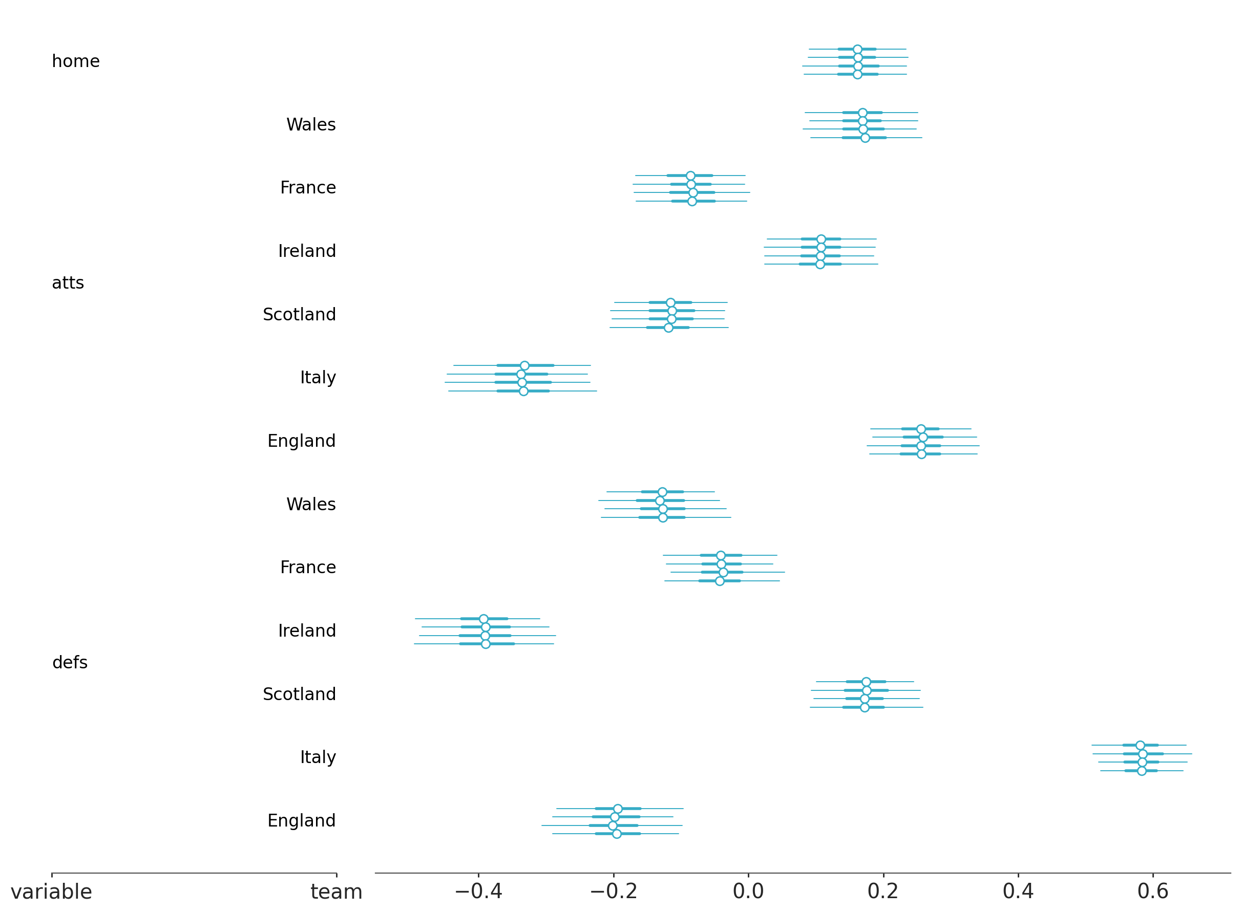
If instead we inspect the PlotCollection returned by plot_forest we’ll see there are different visuals stored.
In this case, all variables are in the same plot because they are differenced by their y coordinate. The plot, row_index and col_index variables are now global, as they are shared by all variables. Still, we continue to have different shapes for different visuals and variables within them.
aes: mapping of aesthetic keys to values and storage all at once#
The other main attribute of PlotCollection is .aes. It is also a DataTree and it has a similar structure. Now the aesthetics are the groups. The contents of these groups depends on the type of mapping defined:
If the aesthetic mapping includes the variables, the group will have variables matching the ones in the input data. Just like what we saw with .viz
If the aesthetic mapping encodes only dimension information the group will have only 1 or 2 variables. The variable mapping will always be present.
It is the one that contains the mapping from dimension(s) to aesthetic values. The second variable is optional: neutral_element. It is only present
when the mapping defined is not applicable to all the variables in the input data. When present it is always a scalar containing the neutral element.
Instead of storing plotted objects, however, it stores aesthetic mapping as key-value pairs.
This allows us to check what properties are being used depending on the coordinate values they represent. For example, we can then access them for further manual plotting using the same mappings. Similarly, it is also possible to modify them before calling (more) plotting functions that would then use the updated mappings instead.
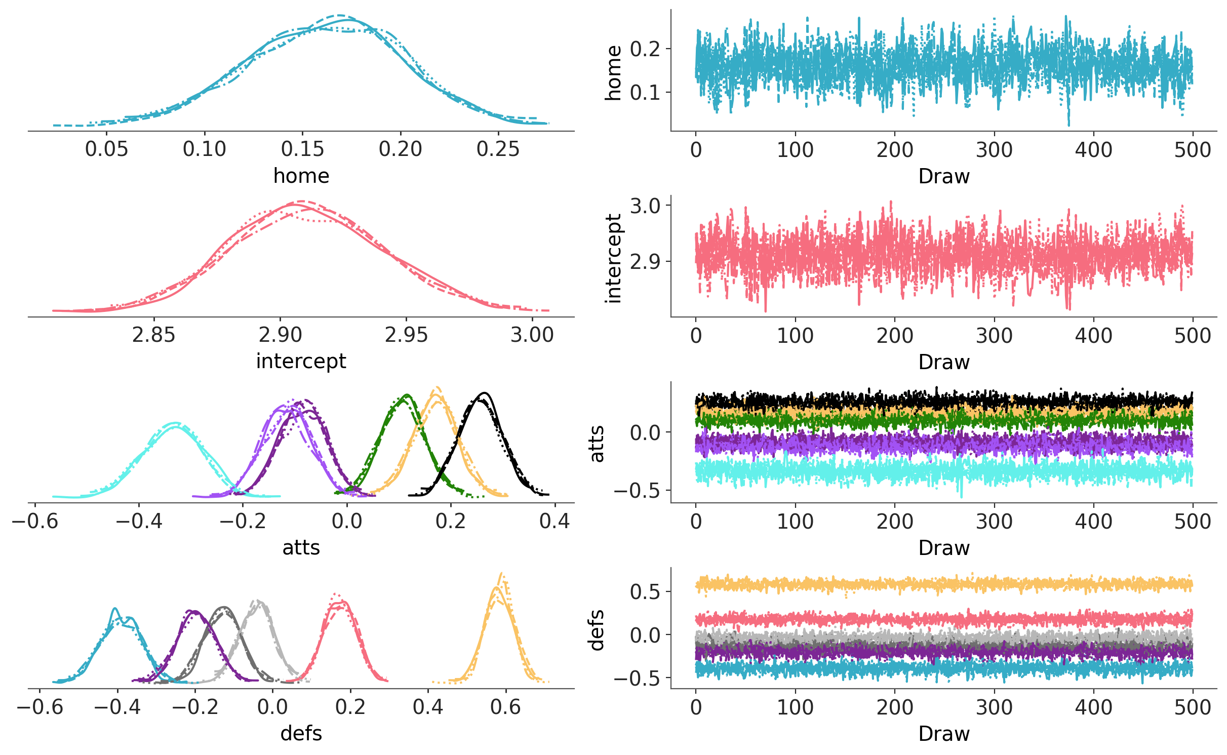
Inspecting the aes attribute we can see that the linestyle depends on the coordinate value of the chain dimension,
and the color depends on both the data variable and the team dimension. All of this information clearly matches what we can see in the plot.
pc.aes
<xarray.DatasetView> Size: 0B
Dimensions:  ()
Data variables:
    *empty*
As the color depends on both the variable and the team, its group within .aes has variables matching those of the input data. On the other hand, as the linestyle only depends on the chain, it gets the mapping variable.
There is also an extra aesthetic called overlay whose value is ignored, but whose presence ensures we’ll loop over the right dimensions and draw the expected lines.
This is helpful to plot multiple subsets all with the same visual properties, which is the default behaviour in plot_ppc or to ensure the plot
behaves as expected even if we disable some of the default aesthetic mappings like we do in this example.
If you pass keyword arguments to map, those arguments will be used in all the calls to the plotting function .map does.
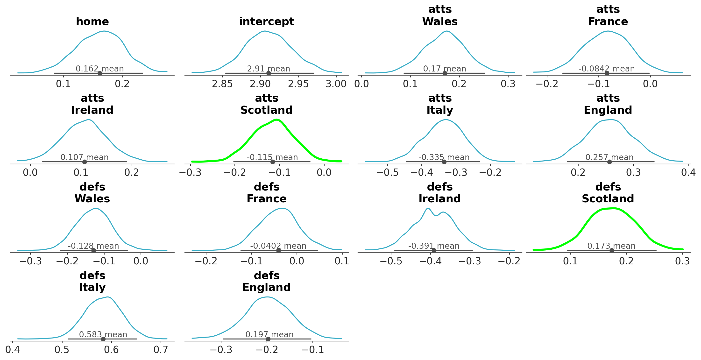
However, in some cases we might want more control. The next cell shows an example. We directly manipulate these properties to highlight only variables that correspond to the national team of Scotland.
Important
As we have already mentioned, the structure of the .viz attribute is backend agnostic, but its contents are backend dependent.
Consequently, the steps to select a specific visual given variable names and coordinates is always the same, but the result of that
is an object from the chosen plotting backend. Thus, modifying the visual element is backend dependent and we consider that adding helper functions for such tasks is out of the scope of the library.
You can interact with the .viz attribute as you’d interact with any xarray.DataTree. It is also possible to use the get_viz helper method to simplify these calls a bit. See the differences below:
pc=plot_dist(idata,var_names=["home","intercept","atts","defs"])atts_scotland_kde=pc.viz["kde"]["atts"].sel(team="Scotland").item()# atts_scotland_kde is now the Line2D object that# corresponds to the kde line of the coordinate Scotland of variable attsatts_scotland_kde.set(linewidth=3,color="lime")pc.get_viz("kde","defs",team="Scotland").set(linewidth=3,color="lime");
You are not limited to only manipulating visual element properties. In the next cell, we show how to manipulate plot properties; in this case to add a grid to only the intercept plot.
pc=plot_dist(idata,var_names=["home","atts","defs"],backend="bokeh",# make plot smallerfigure_kwargs={"figsize":(1300,600),"figsize_units":"dots"},)pe_glyph=pc.get_viz("point_estimate","atts",team="Italy").glyphpe_glyph
x = Field(field='x', transform=Unspecified, units=Unspecified),
y = Field(field='y', transform=Unspecified, units=Unspecified))
We can inspect and modify any of the stored elements by their labels. We have saved the Bokeh object that corresponds to the point estimate dot in the atts[team=Italy] plot.
We can now change some of its properties before rendering the figure:
In some cases, it is more convenient to select elements based on their positions in the plot grid, rather than by variable names or coordinates. The row_index and col_index groups are provided for this purpose.
Note
Selection with row and column is a bit more convoluted that it might need to be, but this also serves to illustrate an important issue.
Some operations on the DataTree/Dataset/DataArray objects will trigger copies, which don’t play well with the majority of plotting backend objects.
Here for example, attempting to use .where(condition,drop=True) which would make things more direct will trigger a copy and because of that the plotting backend will raise an error.
We are forced to convert the .where operation to an indexing one.
pc=plot_dist(idata,var_names=["home","atts","defs"],backend="bokeh",# make plot smallerfigure_kwargs={"figsize":(1300,600),"figsize_units":"dots"},)importnumpyasnpcondition=(pc.get_viz("row_index","defs")==2)&(pc.get_viz("col_index","defs")==1)cond_sel={"team":condition.coords["team"][condition]}kde_glyph=pc.get_viz("kde","defs",cond_sel).glyphkde_glyph.line_color="lime"kde_glyph.line_width=4pc.show()
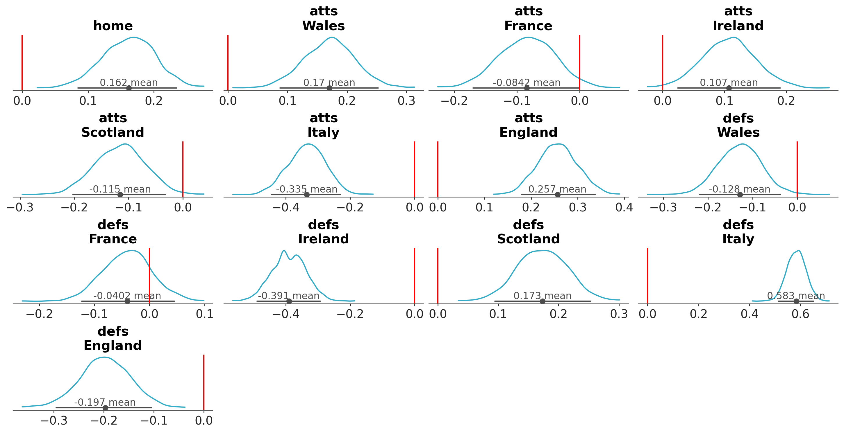
Instead of modifying existing visual elements, we might instead want to add more elements to the plots.
If we want to add something to a specific plot, the procedure is basically the same as above with the only difference
of calling a plotting function instead of modifying properties of the existing elements.
For example, let’s plot a vertical reference line to the defs of the France national team:
If we instead want to apply it to all plotting functions, we can use map:
# to be able to use map, callables must accept 2 positional arguments# a DataArray and the plotting targetdefaxvline(da,target,**kwargs):returntarget.axvline(0,**kwargs)pc=plot_dist(idata,var_names=["home","atts","defs"])pc.map(axvline,color="red")
See also
The map method is one of the main building blocks provided by PlotCollection. The Create your own figure with PlotCollection page covers the use of map more extensively.
PlotCollection also provides a method to automatically generate legends for the plots.
Warning
The API of the add_legend method is still quite experimental.
For properties that are shared for all variables, generating the legend is relatively straightforward. Mappings are unique, and we have sensible defaults available: coordinate values as legend entries and the dimension name as the legend title.
It is also possible to have properties that depend on both the data variable and dimensions. In general, aesthetic mappings can be complex, with dependencies on arbitrary combinations of variables and dimensions. There can even be combinations of aesthetics which map to combinations of variables and dimensions!
Moreover, we sometimes use aesthetic mappings as a way to distinguish different visual elements or groups of visual elements. In these cases we might not need a legend, or we might even prefer to omit it.
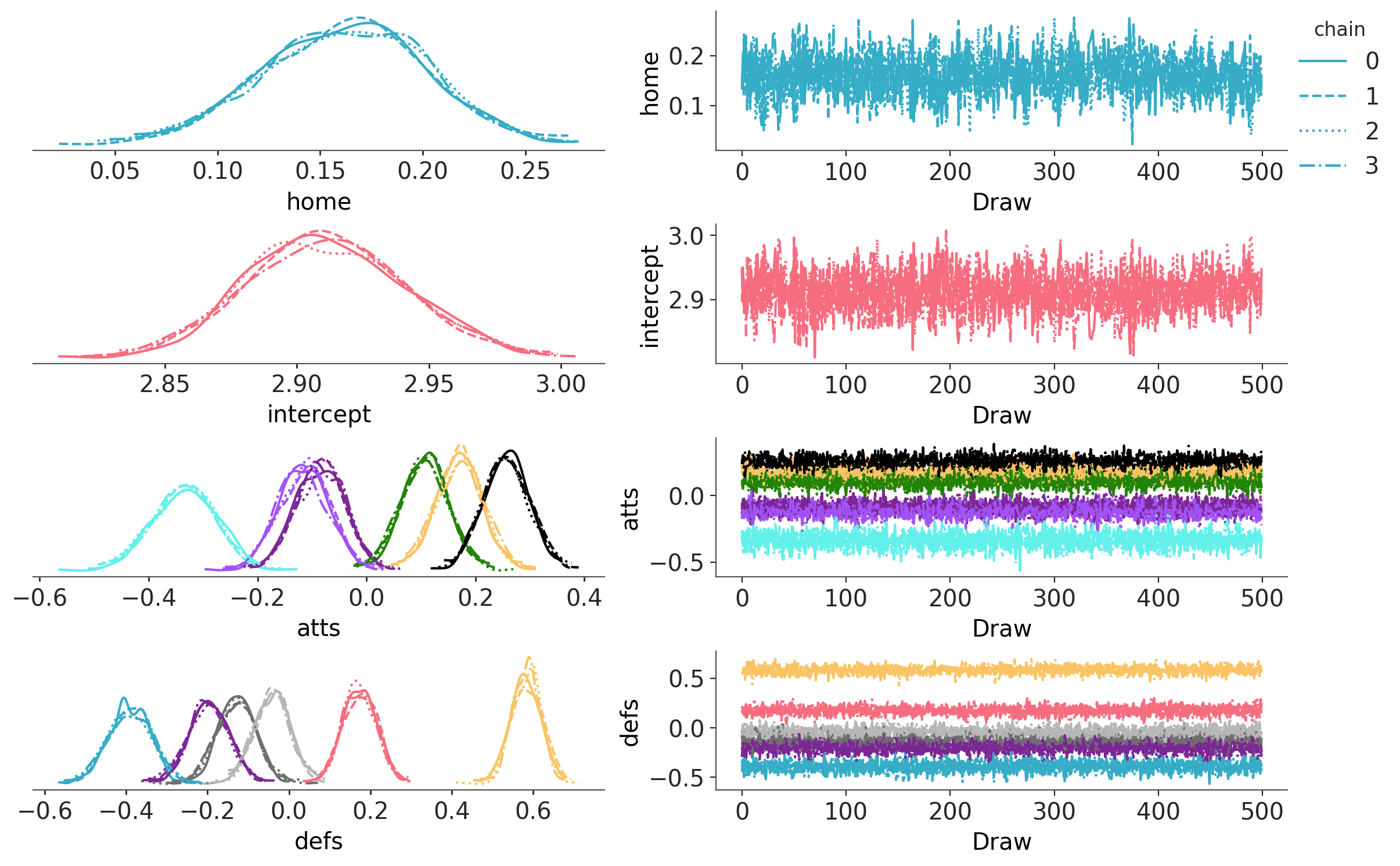
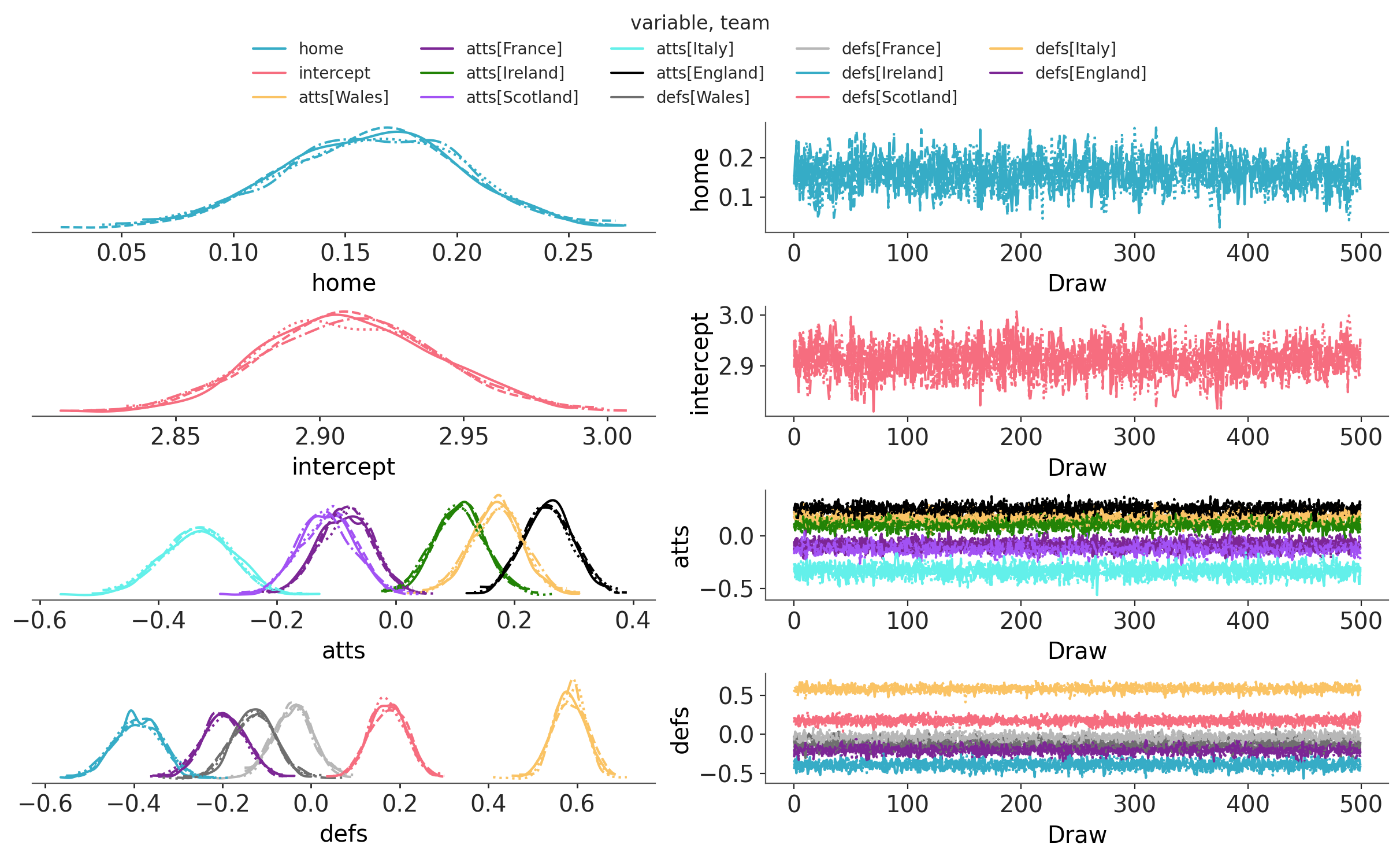
The example we have just seen, which we’ll also repeat below, has a bit of everything. On one hand, we might need two legends: one for the color encoding into variable+team and another for the linestyle encoding into the chain. On the other hand, in this particular example (and in general when using plot_trace_dist as a diagnostic) we don’t really care about the specific encodings. The different colors for different variable+team combinations allow us to check if same color lines overlap, meaning all chains have converged to the same distribution.
Knowing if the yellow line is atts for the Italy team or defs for the Scotland team is irrelevant to our goal of diagnosing convergence. So is knowing if the dashed line represents the chain 0 or the 3.
Therefore, it would be OK to skip both legends altogether. Using PlotCollection you can choose in couple lines which situation best adapts to your particular use-case: no legend, legend for a subset of the mappings or one legend for each aesthetic mapping.
To add a legend on a mapping over multiple dimensions we use a sequence of dimensions (with __variable__ also being valid) as first argument. Here we also add matplotlib specific kwargs to get the legend to look better:
In this example each combination of variable and dimension is encoded in a single aesthetic, but that is not necessarily true. The Advanced examples section has some examples with multiple aesthetics mapped to the same dimension combination. In such cases, the legend requested for such dimension shows the multiple aesthetics.
See also
coming soon: In depth explanation of how faceting and aesthetics are handled
coming soon: backend specific cookbooks
Create your own figure with PlotCollection shows how to create and fill visualizations from scratch using PlotCollection. There is nothing wrong with modifying an exising figure through its PlotCollection. In fact, the design of arviz-plots encourages it and goes to great lengths to make sure it is possible. That being said, if you find yourself constantly needing to modify the generated PlotCollections it might be need to generate your own specific plotting functions.