arviz_plots.plot_ppc_pava#
- arviz_plots.plot_ppc_pava(dt, data_type='binary', n_bootstaps=1000, ci_prob=None, var_names=None, filter_vars=None, group='posterior_predictive', coords=None, sample_dims=None, plot_collection=None, backend=None, labeller=None, aes_by_visuals=None, visuals=None, **pc_kwargs)[source]#
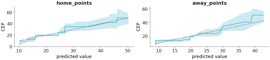
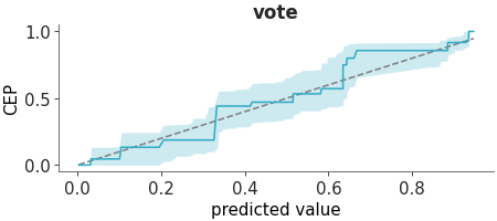
PAV-adjusted calibration plot.
Uses the pool adjacent violators (PAV) algorithm for isotonic regression. An a 45-degree line corresponds to perfect calibration. Details are discussed in [1] and [2].
- Parameters:
- dt
xarray.DataTree Input data
- data_type
str Defaults to “binary”. Other options are “categorical” and “ordinal”. If “categorical”, the plot will show the “one-vs-others” calibration and generate one plot per category. If “ordinal”, the plot will display cumulative conditional event probabilities and generate (number of categories - 1) plots.
- n_bootstaps
int, optional Number of bootstrap samples to use for estimating the confidence intervals. defaults to 1000.
- ci_prob
float, optional Probability for the credible interval. Defaults to
rcParams["stats.ci_prob"].- num_samples
int, optional Number of samples to use for the plot. Defaults to 100.
- var_names
strorlistofstr, optional One or more variables to be plotted. Currently only one variable is supported. Prefix the variables by ~ when you want to exclude them from the plot.
- filter_vars{
None, “like”, “regex”}, optional, default=None If None (default), interpret var_names as the real variables names. If “like”, interpret var_names as substrings of the real variables names. If “regex”, interpret var_names as regular expressions on the real variables names.
- group
str, optional The group from which to get the unique values. Defaults to “posterior_predictive”. It could also be “prior_predictive”. Notice that this plots always use the “observed_data” so use with extra care if you are using “prior_predictive”.
- coords
dict, optional Coordinates to plot. CURRENTLY NOT IMPLEMENTED
- sample_dims
stror sequence of hashable, optional Dimensions to reduce unless mapped to an aesthetic. Defaults to
rcParams["data.sample_dims"]- plot_collection
PlotCollection, optional - backend{“matplotlib”, “bokeh”, “plotly”}, optional
- labeller
labeller, optional - aes_by_visualsmapping of {
strsequence ofstr}, optional Mapping of visuals to aesthetics that should use their mapping in
plot_collectionwhen plotted. Valid keys are the same as forvisuals.- visualsmapping of {
strmapping orFalse}, optional Valid keys are:
lines -> passed to
line_xymarkers -> passed to
scatter_xyreference_line -> passed to
line_xycredible_interval -> passed to
fill_between_yxlabel -> passed to
labelled_xylabel -> passed to
labelled_ytitle -> passed to
labelled_title
markers defaults to False, no markers are plotted. Pass an (empty) mapping to plot markers.
- **pc_kwargs
Passed to
arviz_plots.PlotCollection.grid
- dt
- Returns:
References
[1]Säilynoja et al. Recommendations for visual predictive checks in Bayesian workflow. (2025) arXiv preprint https://arxiv.org/abs/2503.01509
[2]Dimitriadis et al Stable reliability diagrams for probabilistic classifiers. PNAS, 118(8) (2021). https://doi.org/10.1073/pnas.2016191118
Examples
Plot the PAVA calibration plot for the rugby dataset.
>>> from arviz_plots import plot_ppc_pava, style
>>> style.use("arviz-variat")
>>> from arviz_base import load_arviz_data
>>> dt = load_arviz_data('rugby')
>>> plot_ppc_pava(dt, ci_prob=0.90)