arviz_plots.plot_ppc_rootogram#
- arviz_plots.plot_ppc_rootogram(dt, ci_prob=None, yscale='sqrt', data_pairs=None, var_names=None, filter_vars=None, group='posterior_predictive', coords=None, sample_dims=None, plot_collection=None, backend=None, labeller=None, aes_by_visuals=None, visuals=None, **pc_kwargs)[source]#
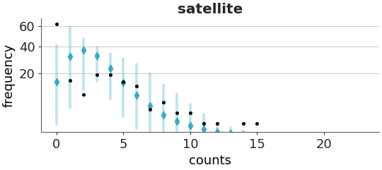
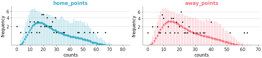
Rootogram with confidence intervals per predicted count.
Rootograms are useful to check the calibration of count models. A rootogram shows the difference between observed and predicted counts. The y-axis, showing frequencies, is on the square root scale. This makes easier to compare observed and expected frequencies even for low frequencies [1] and [2].
For more details on how to interpret this plot, see https://arviz-devs.github.io/EABM/Chapters/Prior_posterior_predictive_checks.html
- Parameters:
- dt
xarray.DataTree If group is “posterior_predictive”, it should contain the
posterior_predictiveandobserved_datagroups. If group is “prior_predictive”, it should contain theprior_predictivegroup.- ci_prob
float, optional Probability for the credible interval. Defaults to
rcParams["stats.ci_prob"].- yscale
str, optional Scale for the y-axis. Defaults to “sqrt”, pass “linear” for linear scale. Currently only “matplotlib” backend is supported. For “bokeh” and “plotly” the y-axis is linear.
- data_pairs
dict, optional Dictionary of keys prior/posterior predictive data and values observed data variable names. If None, it will assume that the observed data and the predictive data have the same variable name.
- var_names
strorlistofstr, optional One or more variables to be plotted. Currently only one variable is supported. Prefix the variables by ~ when you want to exclude them from the plot.
- filter_vars{
None, “like”, “regex”}, optional, default=None If None (default), interpret var_names as the real variables names. If “like”, interpret var_names as substrings of the real variables names. If “regex”, interpret var_names as regular expressions on the real variables names.
- groupstr,
Group to be plotted. Defaults to “posterior_predictive”. It could also be “prior_predictive”.
- coords
dict, optional Coordinates to plot.
- sample_dims
stror sequence of hashable, optional Dimensions to reduce unless mapped to an aesthetic. Defaults to
rcParams["data.sample_dims"]- plot_collection
PlotCollection, optional - backend{“matplotlib”, “bokeh”, “plotly”}, optional
- labeller
labeller, optional - aes_by_visualsmapping of {
strsequence ofstr}, optional Mapping of visuals to aesthetics that should use their mapping in
plot_collectionwhen plotted. Valid keys are the same as forvisuals.- visualsmapping of {
strmapping orFalse}, optional Valid keys are:
predictive_markers -> passed to
scatter_xyobserved_markers -> passed to
scatter_xy.credible_interval -> passed to
ci_line_yxlabel -> passed to
labelled_xylabel -> passed to
labelled_ygrid -> passed to
gridtitle -> passed to
labelled_title
observed_markers defaults to False, no observed data is plotted, if group is “prior_predictive”. Pass an (empty) mapping to plot the observed data.
- **pc_kwargs
Passed to
arviz_plots.PlotCollection.wrap
- dt
- Returns:
References
[1]Kleiber C, Zeileis A. Visualizing Count Data Regressions Using Rootograms. The American Statistician, 70(3). (2016) https://doi.org/10.1080/00031305.2016.1173590
[2]Säilynoja et al. Recommendations for visual predictive checks in Bayesian workflow. (2025) arXiv preprint https://arxiv.org/abs/2503.01509
Examples
Plot the rootogram for the crabs dataset.
>>> from arviz_plots import plot_ppc_rootogram, style
>>> style.use("arviz-variat")
>>> from arviz_base import load_arviz_data
>>> dt = load_arviz_data('crabs_poisson')
>>> plot_ppc_rootogram(dt)