arviz_plots.plot_ppc_dist#
- arviz_plots.plot_ppc_dist(dt, data_pairs=None, var_names=None, filter_vars=None, group='posterior_predictive', coords=None, sample_dims=None, kind=None, num_samples=50, plot_collection=None, backend=None, labeller=None, aes_by_visuals=None, visuals=None, stats=None, **pc_kwargs)[source]#
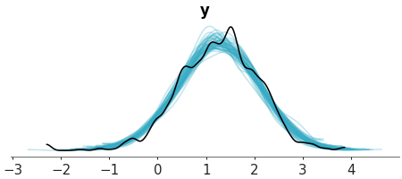
Plot 1D marginals for the posterior/prior predictive distribution and the observed data.
- Parameters:
- dt
xarray.DataTree If group is “posterior_predictive”, it should contain the
posterior_predictiveandobserved_datagroups. If group is “prior_predictive”, it should contain theprior_predictivegroup.- data_pairs
dict, optional Dictionary of keys prior/posterior predictive data and values observed data variable names. If None, it will assume that the observed data and the predictive data have the same variable name.
- var_names
strorlistofstr, optional One or more variables to be plotted. Prefix the variables by ~ when you want to exclude them from the plot.
- filter_vars{
None, “like”, “regex”}, default=None If None, interpret var_names as the real variables names. If “like”, interpret var_names as substrings of the real variables names. If “regex”, interpret var_names as regular expressions on the real variables names.
- groupstr,
Group to be plotted. Defaults to “posterior_predictive”. It could also be “prior_predictive”.
- coords
dict, optional - sample_dims
stror sequence of hashable, optional Dimensions to reduce unless mapped to an aesthetic. Defaults to
rcParams["data.sample_dims"]- kind{“kde”, “hist”, “ecdf”}, optional
How to represent the marginal density. Defaults to
rcParams["plot.density_kind"]- num_samples
int, optional Number of samples to plot. Defaults to 100.
- plot_collection
PlotCollection, optional - backend{“matplotlib”, “bokeh”}, optional
- labeller
labeller, optional - aes_by_visualsmapping of {
strsequence ofstr}, optional Mapping of visuals to aesthetics that should use their mapping in
plot_collectionwhen plotted. Valid keys are the same as forvisualsexcept “remove_axis”.With a single model, no aesthetic mappings are generated by default, each variable+coord combination gets a plot but they all look the same, unless there are user provided aesthetic mappings. With multiple models,
plot_distmaps “color” and “y” to the “model” dimension.By default, all aesthetics but “y” are mapped to the distribution representation, and if multiple models are present, “color” and “y” are mapped to the credible interval and the point estimate.
When “point_estimate” key is provided but “point_estimate_text” isn’t, the values assigned to the first are also used for the second.
- visualsmapping of {
strmapping orFalse}, optional Valid keys are:
predictive_dist, observed_dist -> passed to a function that depends on the kind argument.
title -> passed to
labelled_titleremove_axis -> not passed anywhere, can only be
Falseto skip calling this function
observed_dist defaults to False, no observed data is plotted, if group is “prior_predictive”. Pass an (empty) mapping to plot the observed data.
- statsmapping, optional
Valid keys are:
predictive_dist, observed_dist -> passed to kde, ecdf, …
- **pc_kwargs
Passed to
wrap
- dt
- Returns:
See also
- Introduction to batteries-included plots
General introduction to batteries-included plotting functions, common use and logic overview
Examples
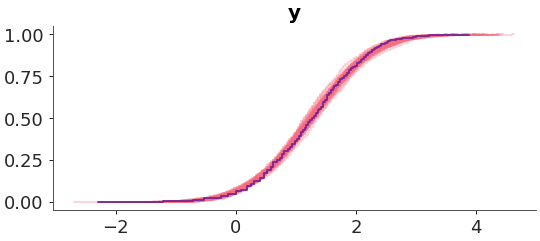
Make a plot of the posterior predictive distribution vs the observed data. We used an ECDF representation customized the colors.
>>> from arviz_plots import plot_ppc_dist, style
>>> style.use("arviz-variat")
>>> from arviz_base import load_arviz_data
>>> radon = load_arviz_data('radon')
>>> pc = plot_ppc_dist(
>>>     radon,
>>>     kind="ecdf",
>>>     visuals={
>>>         "predictive_dist": {"color":"C1"},
>>>         "observed_dist": {"color":"C3"}
>>>     },
>>> )