Example gallery#
See also
Introduction to batteries-included plots: A general overview of batteries-included plotting functions, their common use cases, and the underlying logic.
Distribution visualization#
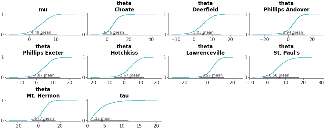
Faceted histogram plots for 1D marginals of the distribution. The point_estimate_text option is set to False to omit that visual from the plot.
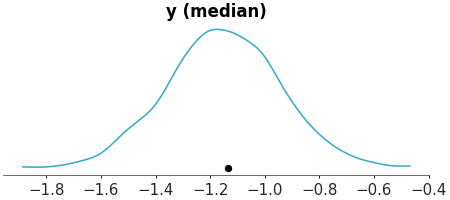
Posterior Histograms
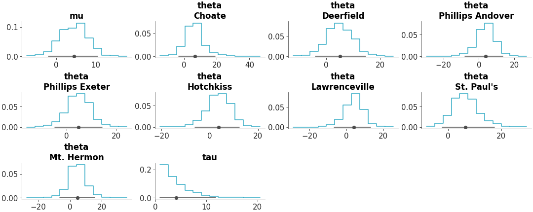
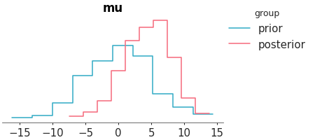
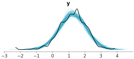
KDE plot of the variable mu from the centered eight model. The sample_dims parameter is used to restrict the KDE computation along the draw dimension only.”
Posterior KDEs
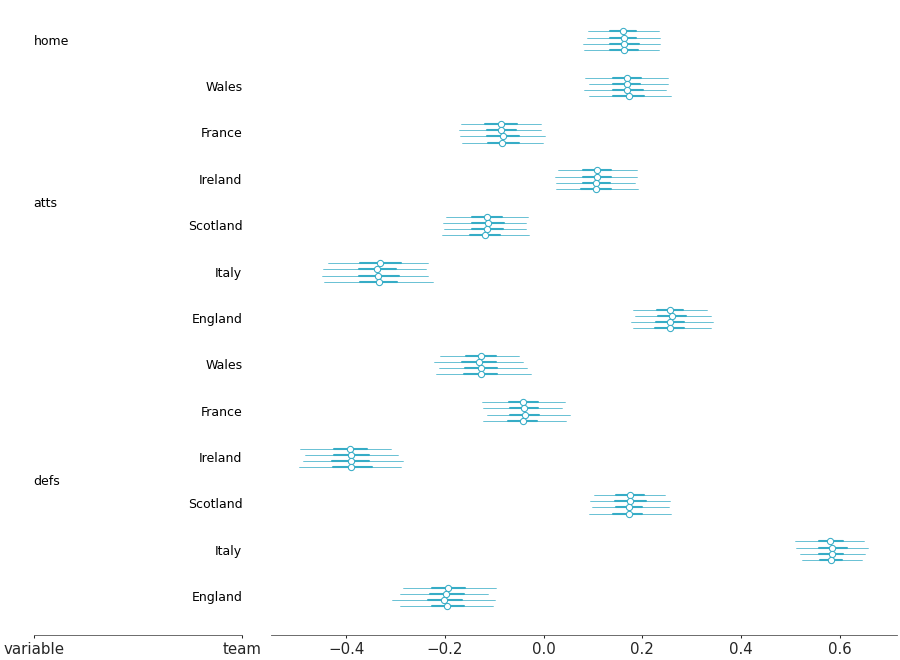
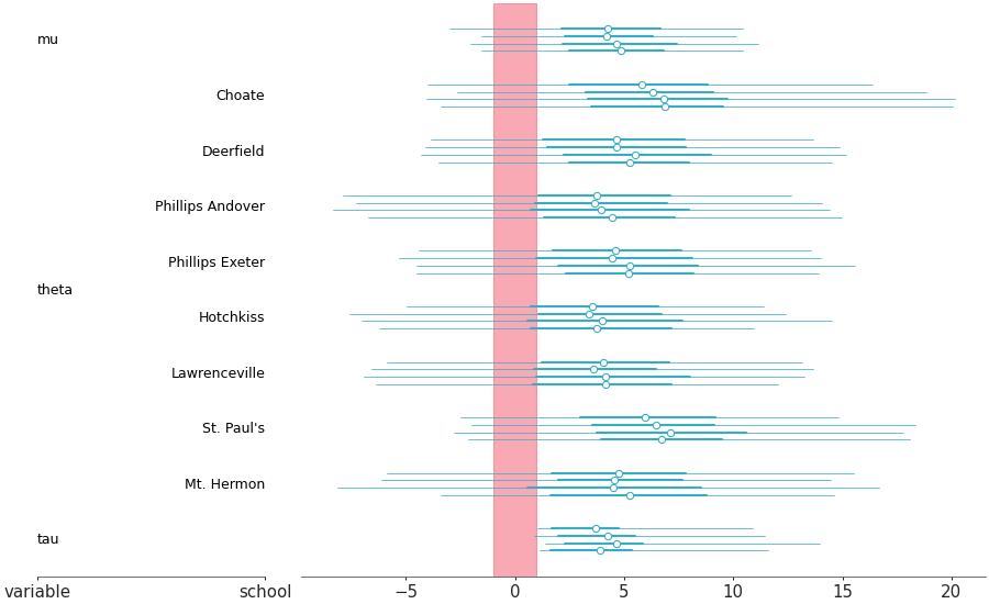
Forest plot marginal summaries with row shading to enhance reading
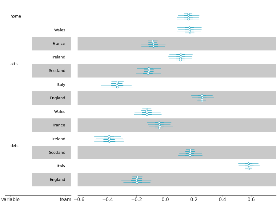
Forest plot with shading
Plot one variable against other variables in the dataset.
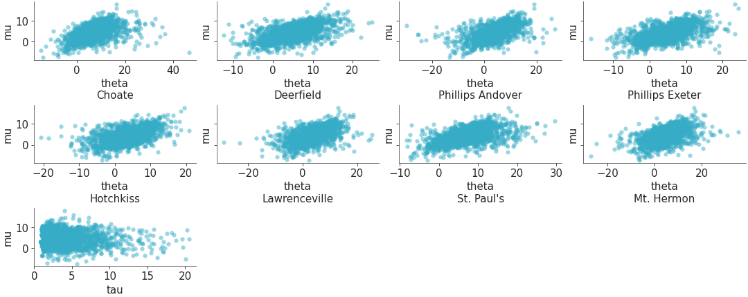
Scatterplot one variable against all others
Plot all variables against each other in the dataset.
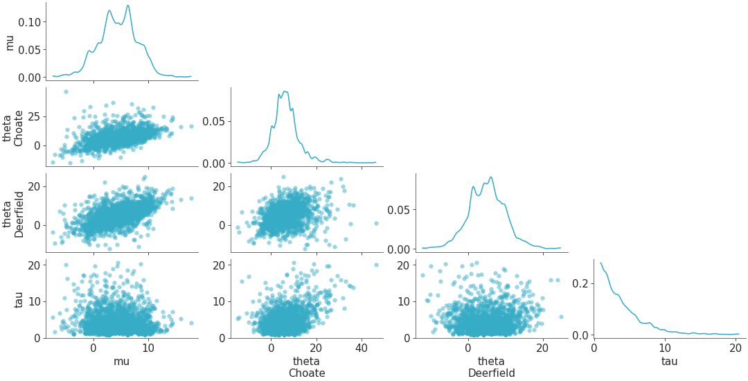
Scatterplot all variables against each other
Visual representation of marginal distributions over the y axis for a single model
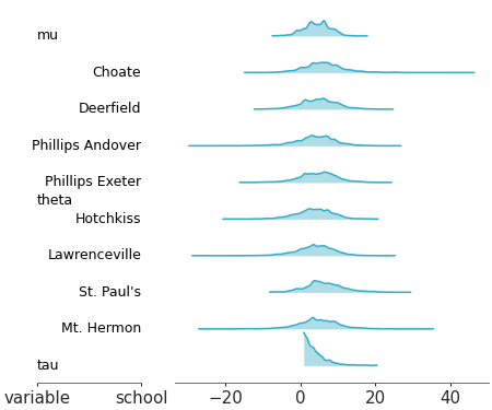
Ridge plot
Posterior comparison#
Full marginal distribution comparison between different models
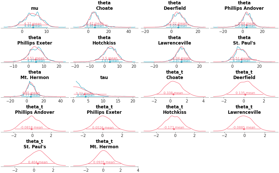
Posterior KDEs for two models
Forest plot summaries for 1D marginal distributions
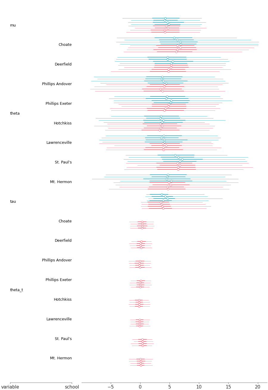
Posterior forest for two models
Visual representation of marginal distributions over the y axis showing for multiple models
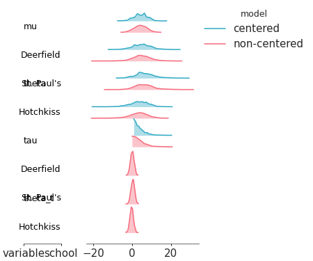
Ridge plot for multiple models
Inference diagnostics#
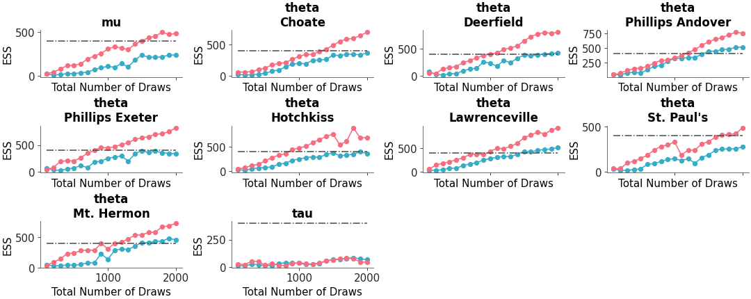
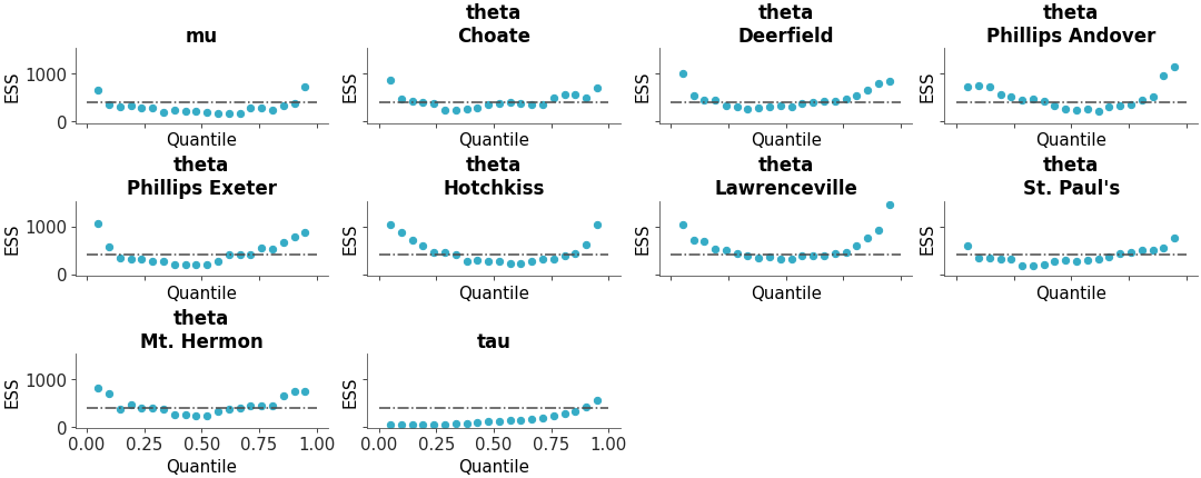
Full ESS (Either local or quantile) comparison between different models
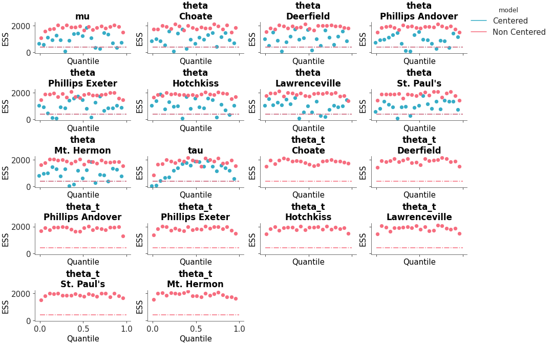
ESS comparison
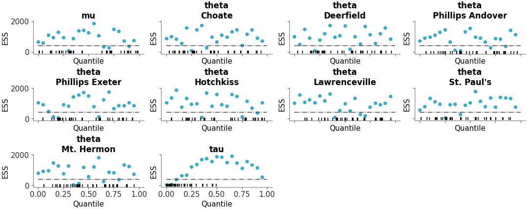
Plot the distribution of ESS and R-hat.
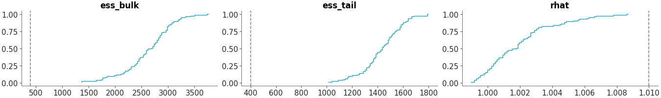
Convergence diagnostics distribution
Plot one variable against other variables in the dataset.
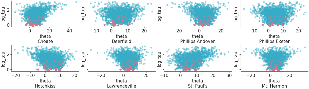
Scatter plot of one variable against all other variables with divergences
Plot all variables against each other in the dataset.
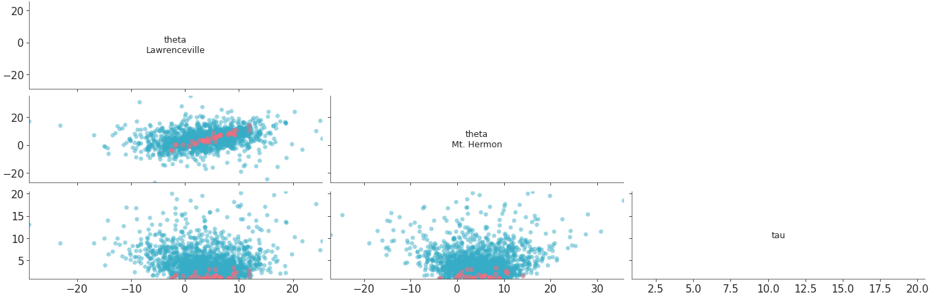
Scatter plot of all variables against each other with divergences
Plot parallel coordinates plot showing posterior points with divergences..
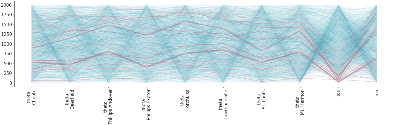
Parallel coordinates plot
Predictive checks#
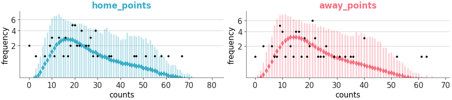
Plot of samples from the posterior predictive and observed data.
Predictive check with KDEs
PAV-adjusted calibration plot for binary predictions.
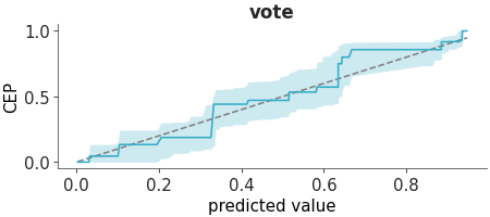
PAV-adjusted calibration
Plot of the probability integral transform of the posterior predictive distribution with respect to the observed data.
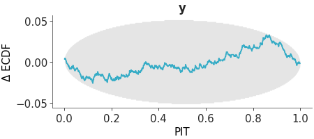
PIT ECDF
Plot of the probability integral transform of the posterior predictive distribution with respect to the observed data using the leave-one-out (LOO) method.
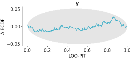
LOO-PIT ECDF
Overlay of forest plot for the posterior predictive samples and the actual observations
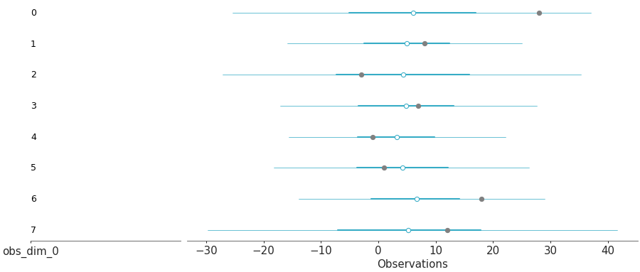
Posterior predictive forest and observations
Prior and likelihood sensitivity checks#
The posterior sensitivity is assessed by power-scaling the prior or likelihood and visualizing the resulting changes. Sensitivity can then be quantified by considering how much the perturbed posteriors differ from the base posterior.

Sensitivity posterior marginals
The posterior quantities are computed by power-scaling the prior or likelihood and visualizing the resulting changes. Sensitivity can then be quantified by considering how much the perturbed quantities differ from the base quantities.
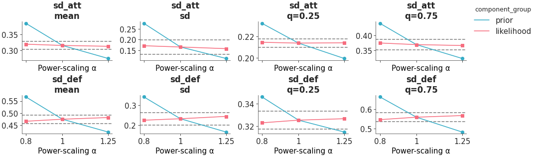
Sensitivity posterior quantities
Model Comparison#
Compare multiple models using predictive accuracy estimated using PSIS-LOO-CV. Usually the DataFrame cmp_df is generated using ArviZ’s ```compare` function.
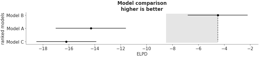
Predictive model comparison
Compute Bayes factor using Savage–Dickey ratio. We can apply this function when the null model is nested within the alternative. In other words when the null (ref_val) is a particular value of the model we are building (see here). For others cases computing Bayes factor is not straightforward and requires more complex methods. Instead, of Bayes factors, we usually recommend Pareto smoothed importance sampling leave one out cross validation (PSIS-LOO-CV). In ArviZ, you will find them as functions with loo in their names.
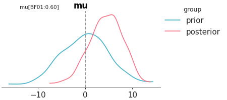
Bayes_factor
Simulation Based Calibration#
Faceted plot with PIT Δ-ECDF values for each variable The plot_ecdf_pit function assumes the values passed to it has already been transformed to PIT values, as in the case of SBC analysis or values from arviz_base.loo_pit. The distribution should be uniform if the model is well-calibrated. To make the plot easier to interpret, we plot the Δ-ECDF, that is, the difference between the expected CDF from the observed ECDF. As small deviations from uniformity are expected, the plot also shows the credible envelope.
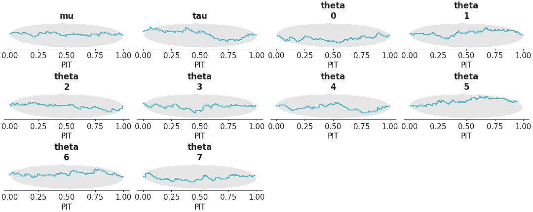
PIT-ECDF
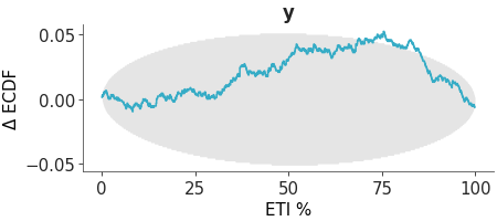
Coverage refers to the proportion of true values that fall within a given prediction interval. For a well-calibrated model, the coverage should match the intended interval width. For example, a 95% credible interval should contain the true value 95% of the time. The distribution should be uniform if the model is well-calibrated. To make the plot easier to interpret, we plot the Δ-ECDF, that is, the difference between the expected CDF from the observed ECDF. As small deviations from uniformity are expected, the plot also shows the credible envelope. We can compute the coverage for equal-tailed intervals (ETI) by passing coverage=True to the plot_ecdf_pit function. This works because ETI coverage can be obtained by transforming the PIT values. However, for other interval types, such as HDI, coverage must be computed explicitly and is not supported by this function.
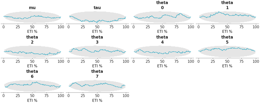
Coverage ECDF
Mixed plots#
Two column layout with marginal distributions on the left and fractional ranks on the right
Rank and distribution plot
Two column layout with marginal distributions on the left and MCMC traces on the right
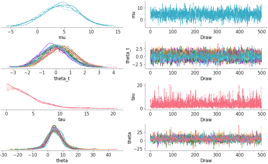
Trace and distribution plot
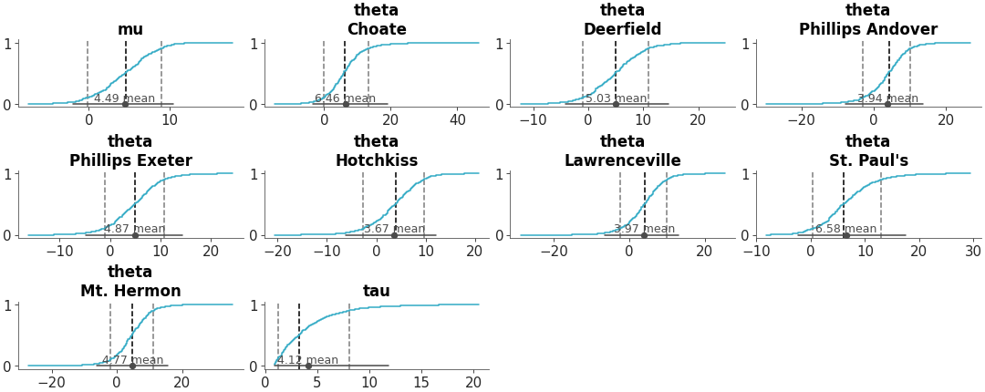
Multiple panel visualization with a forest plot and ESS information
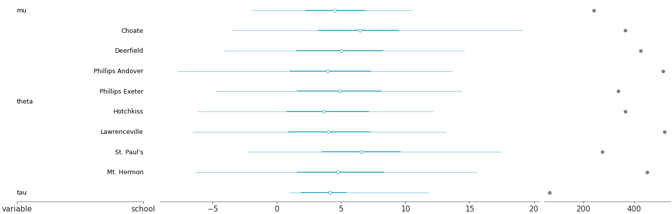
Forest plot with ESS
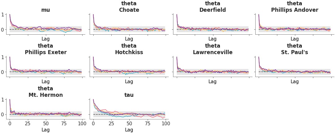
Arrange three diagnostic plots (ESS evolution plot, rank plot and autocorrelation plot) in a custom column layout.
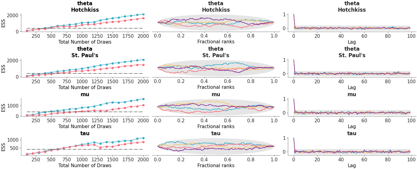
Custom diagnostic plots combination
Helper Functions#
Draw lines on plots to highlight specific thresholds, targets, or important values.
Add Lines